|
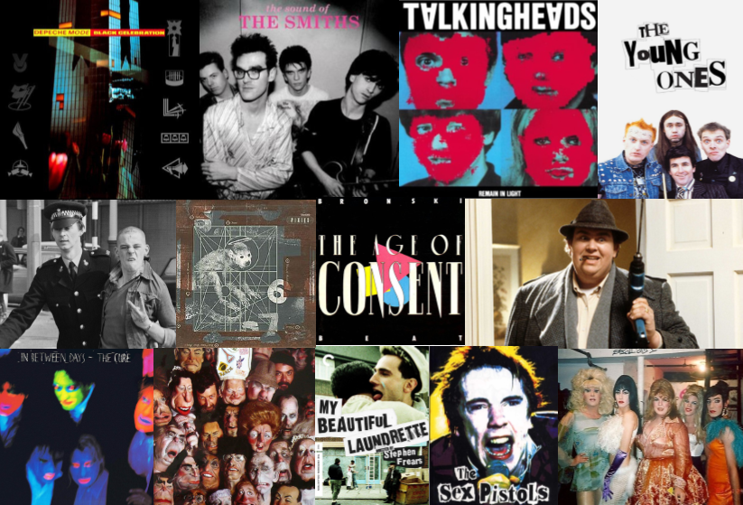
Ah, the 1980s, the Golden Age of TV, pre-internet, VHS, the Sony Walkman, mixtapes, GOOD MUSIC... I could go on. In our last lecture of the year with Nick, we were taken back to the 1980s where we explored the influence of politics on Britain's culture and how the events of the 1980s have shaped the economy, society, and culture ever since. Throughout the lecture it was made clear that there was a clash between official and unofficial culture, official being commercially conscious and unofficial being inspired by rebellion- especially against the Thatcherite zeitgeist. Increase of rebellion seemed to be mainly in the North, whilst other areas remained mainstream and was subject to American cultural imperialism.
Below are mood-boards I made, the first being an example of OFFICIAL culture and the second being an example of UNOFFICIAL culture:
0 Comments
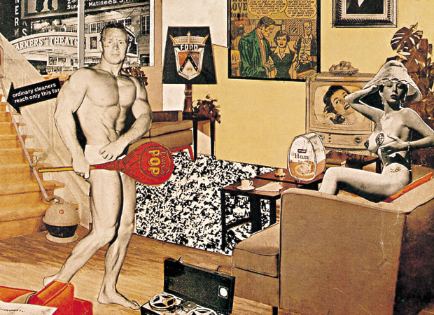
Today's lecture was interesting, we looked at Post-War America, how it was portrayed as this ideal almost perfect land. America profited greatly from the war seeing a boom in the economy and a rise of consumerism. It was also a time where Atomic power was viewed as the future- films, comics and more art work produced in this era reflected upon this, as it often depicted nuclear weapons and use of them. We also looked briefly at how different Britain was during this era- you had America with it's booming economy and on the other hand you had Britain, looking grim, and struggling with its massive debt to America- which was only fully repaid in 2006! America was free of any debt and also free of any damage to its infrastructure or society. There were also $26 billion worth of factories that had been built during the war and in as if things couldn't get any better for them, there was $140 billion in savings and war bonds to be spent. Post War America also saw the beginnings of youth culture starting to form. Illustration often reflected upon this with depictions of Utopian imagery. During this era, I was shocked to see that illustrators were paid a fortune for single or double page spreads in magazines, now in today's day and age that's not the case!! The artist that stood out the most for me in today's lecture was Norman Rockwell. His work is beautifully detailed and can convey a whole story just from the work itself due to the careful detailing in his paintings. The works that made Rockwell famous depicted all sorts of Americans going about their lives. He showed them experiencing both daily travails and simple pleasures. His works were reproduced on magazine covers in the 1930s, ’40s, and ’50s—and their appeal was immense. By the 1940s, Time magazine had already christened Rockwell as “probably the best-loved U.S. artist alive,” while the New York Times had affectionately compared his paintings to Mark Twain’s novels. Above is my version of Hamilton's work. I suppose you could say it highlights the issues within today's society- in a very badly edited way! Politics dominate today's society, with Brexit being a constant topic of discussion, the country is divided, people are becoming more and more money driven...we're all just a massive indecisive wreck, with crooked politicians who lie to us.
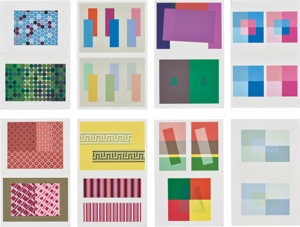
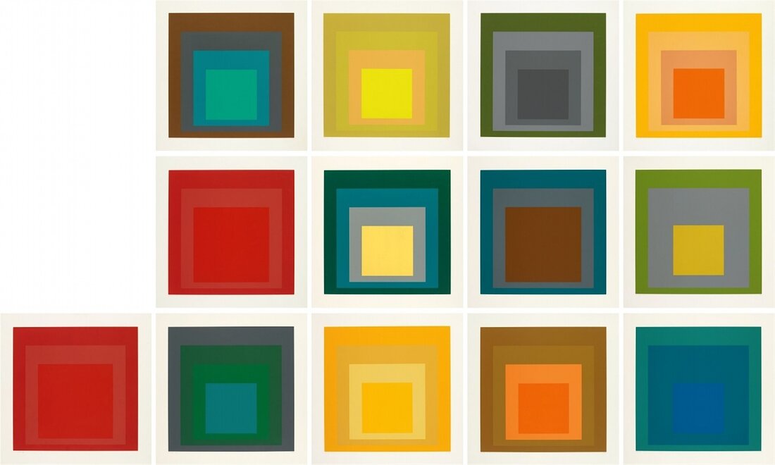
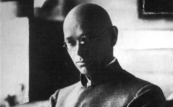
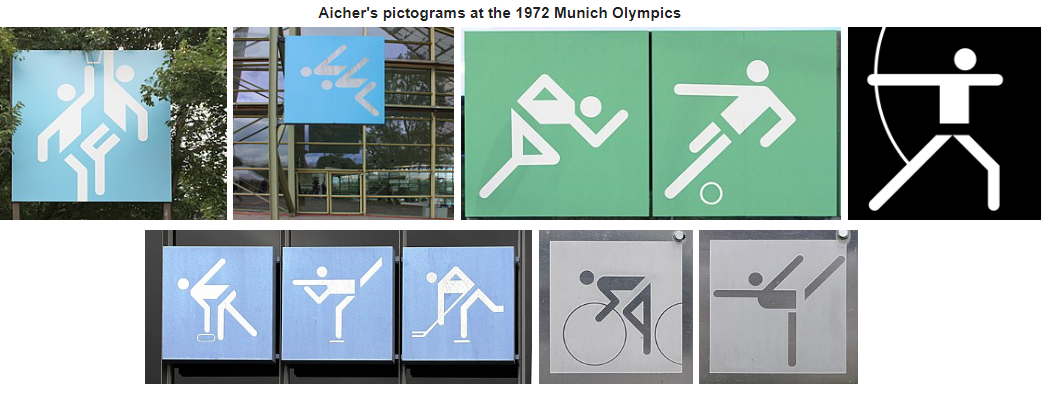
Victor Moscoso is one cool dude...Victor Moscoso (born 1936 in Oleiros, Galicia, Spain) is an American artist best known for producing Psychedelic posters, advertisements, and 'Underground Comix'- for titles such as Yellow Dog, Jiz Comics, Snatch Comics, El Perfecto Comics, and Zap Comix- his psychedelic style made him a noticeable artist internationally. Moscoso studied art at Cooper Union in New York City and at Yale University before moving to San Francisco in 1959. After making the move, he went to the San Francisco Art Institute where he eventually became an 'instructor'. Moscoso's use of vibrating colors was influenced by the painter Josef Albers, who happened to be one of his teachers at Yale. Below are some examples of Albers' work, you can see how his use of colour combination has inspired Moscoso's own work: You can see that Moscoso uses optical effects and color combinations that give the illusion that the design is vibrating off the page. His unique style produces an almost mind-bending sensation of loss of equilibrium, similar to a drugged state (not that I know what this is like of course!!). His poster work is exceptionally individualistic and easily identifiable- as my old college tutor used to say, "It's some hippy-dippy shit." Hmm, Bauhaus...Bauhaus...I'd heard of Bauhaus before...then it came to me, the Bauhaus I'd heard of wasn't the Bauhaus we'd be learning about today. The Bauhaus I'd heard of was the 1978 English Rockband, however they did name themselves after what we'd be looking at in today's lecture which was the Bauhaus German Art School- the greatest art school...in the world (I hope you read that in the voice of Jeremy Clarkson) ANYWAY, Bauhaus was founded in April 1919, in Weimar, Germany. The art school was operational from 1919 to 1933 and it combined crafts and the fine arts, and was famous for the approach to design that it publicized and taught. It was founded upon the idea of creating a "'total' work of art" in which all the arts, including architecture, would eventually be brought together. The Bauhaus movement had a profound influence upon subsequent developments in all categories of art and design. Johannes Itten (11 November 1888 – 25 March 1967) was a Swiss expressionist painter, designer, teacher, writer and theorist associated with the Bauhaus school. From 1919 to 1922, Itten taught at the Bauhaus, developing the innovative "preliminary course" which was to teach students the basics of material characteristics, composition, and color. Itten was heavily influenced by painters, Adolf Hölzel and Franz Cižek. His work has become majorly influential in the fashion industry, particularly the seasonal colour analysis. Below are some examples of Itten's work: Art Nouveau is an ornamental style of art which flourished between about 1890 and 1910 throughout Europe and the United States. The style appeared in a wide variety of strands, and, consequently, it is known by various names, such as the Glasgow Style, or, in the German-speaking world, Jugendstil. Artists drew inspiration from both organic and geometric forms, evolving elegant designs that united flowing, natural forms resembling the stems and blossoms of plants. The desire to abandon the historical styles of the 19th century was an important factor behind Art Nouveau and one that establishes the movement's modernism. Industrial production was, at that point, widespread, and yet the decorative arts were increasingly dominated by poorly-made objects imitating earlier periods. The practitioners of Art Nouveau sought to revive good workmanship, raise the status of craft, and produce genuinely modern design that reflected the utility of the items they were creating. The Ulm school of design was founded in memory of Hans and Sophie Scholl by sibling Inge Scholl back in 1953. Both Hans and Sophie Scholl were key figures in the anti-facism & democracy movement. The school's history evolved through change and innovation, in line with their own self-image of the school as an experimental institution. The teaching as the college was based on a curriculum covering four years. The first academic year was devoted to the basic course and then students chose a specialty from Product Design, Visual Communication, Industrialized Building, Information (which lasted until 1962) and Filmmaking. Although the school ceased operation after fifteen years, the ′Ulm Model′ continues to have a major influence on international design education. Otl AicherOtl Aicher was born on the 13th May 1922 in Ulm, Germany. Aicher was a German graphic designer and typographer. He is best known for having designed pictograms for the 1972 Summer Olympics in Munich that proved influential on the use of stick figures or public signage, as well as designing the typeface, Rotis. He was strongly opposed to the Nazi movement. He was arrested in 1937 for refusing to join the Hitler Youth, and consequently he was failed on his college entrance examination in 1941. He was subsequently drafted into the German army to fight in World War II, though he tried to leave at various times. In 1952 he married Inge Scholl before being a co-founder of the Ulm School of Design, along with Inge Scholl and Max Bill in 1953. The 1972 Summer Olympics pictograms have since inspired various designers due to their simplistic yet universal style.
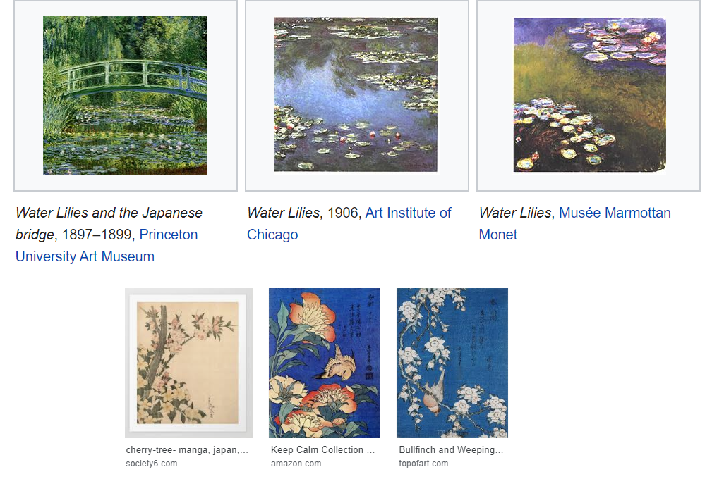
So, the year is 1853, and Japanese ports have reopened to trade with the West. Along with many other goods, Japanese art was one of the main things which were imported into the western art world. Woodcut prints by masters of the ukiyo-e school of printmaking, transformed Impressionist and Post-Impressionist art by demonstrating that simple, transitory, everyday subjects from ‘’the floating world’’ could be presented in appealingly decorative ways. For this weeks blog task we were asked to: take two differing pieces of art or design from the late nineteenth or early twentieth century and explain how the Art of Japan influenced their form, function or manufacture. Upon looking at the work of Vincent Van Gogh, it's clear to see that he was massivley influenced by the art of Japan. Gogh made copies of two Hiroshige prints. He altered their colours and added borders filled with calligraphic characters he borrowed from other prints. As you can see, the prints below are almost identical to the original image: Japonaiserie (English: Japanesery) was the Dutch term that Gogh used to express the influence of Japanese art. He strongly admired the techniques that the Japanese used in their work, in a letter to his brother Theo, he wrote: "I envy the Japanese the extreme clarity that everything in their work has. It's never dull, and never appears to be done too hastily. Their work is as simple as breathing, and they do a figure with a few confident strokes with the same ease as if it was as simple as buttoning your waistcoat." Another artist who was influenced by Japan was Claude Monet. One of Monet’s interests- in addition to painting and gardening- was collecting Japanese art. His home had 231 Japanese woodblocks, Hokusai being prominent among them.
 Today we looked at the semiotics of fashion, looking at the way in how ones clothes can have meaning behind them e.g. clothes can be used as a disguise, they can depict social status and are also used as a form of personal expression; clothes are a kind of 'second skin' . We also discussed how clothes can be seen as cultural markers for example, in a world where culture is in flux (constantly changing) clothes can be a marker for a certain point in time, and the past is constantly regurgitated. We then had an in-depth discussion about jeans (!?) We discussed how jeans reflect different cultural contexts and trends- how the cut and the brand of your jeans can act as powerful symbols e.g. the power of the brand. Brand identity seems to be emphasised more than the industrial process of the jeans; concept over function. For this weeks blog task, we were asked to choose an item of clothing from our own wardrobes. I decided to choose my favourite The Smiths t-shirt (please excuse all the wrinkles!), as I am a massive Smiths fan...I have many more Smiths t-shirts back home in Wales, but most of them are now vacuum-packed due to the lack of space in my bedroom! I got this t-shirt from Amazon, it was a decent price. It's made from 100% cotton and is made by the brand, "Froot of the Loom" They allow you to customize your own clothes, they are usually quite popular with work attire (printing your work's logo on a polo shirt for example) I also remember having one of their polo shirts when I was in my Primary School's choir! They seem pretty reasonably priced to produce therefore I can see why people would choose to use their services to mass-produce t-shirts and so on. Back to The Smiths t-shirt, it's simple, nothing too flash. I like to wear it to show that I am a fan of their music- I wear it as a form of self-expression in the music I like and I think for many, a band t-shirt is a way of expressing oneself by 'revealing' what type of music they're into. (However in many circumstances band t-shirts such as Pink Floyd and Joy Division are worn purely for the aesthetic, not because the individuals are fans of the bands! Although I will agree that the album covers are rather unusual and are a nice design to have on a t-shirt!!) Regardless of whether or not a t-shirt/top you wear has a band or whatever on it, I think that all clothing/fashion acts as a form of self-expression and is a part of an individuals identity. |
AuthorFfion/ 21/ Welsh/ University of Cumbria. Archives
December 2019
Categories |
Site powered by Weebly. Managed by 34SP.com








 RSS Feed