CREATING A PROTEST PACK.
THE BRIEF: identify a problem that, to your mind, needs to be fought against, needs to be given attention and that would benefit from a wider awareness.
This could be a global issue or it could be a small and more local concern. You are going to create the materials which will be used to protest against your chosen injustice and inform those less familiar with it - importantly, the materials you create should available to be used by anyone, anywhere, to join the fight. My interests.
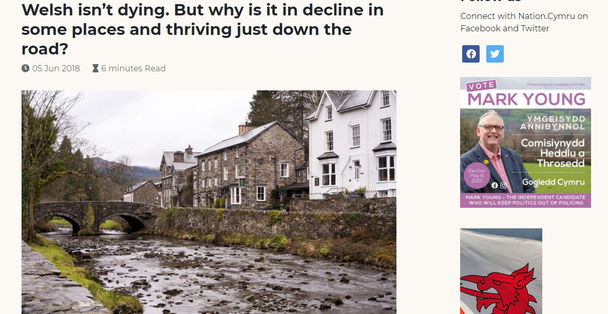
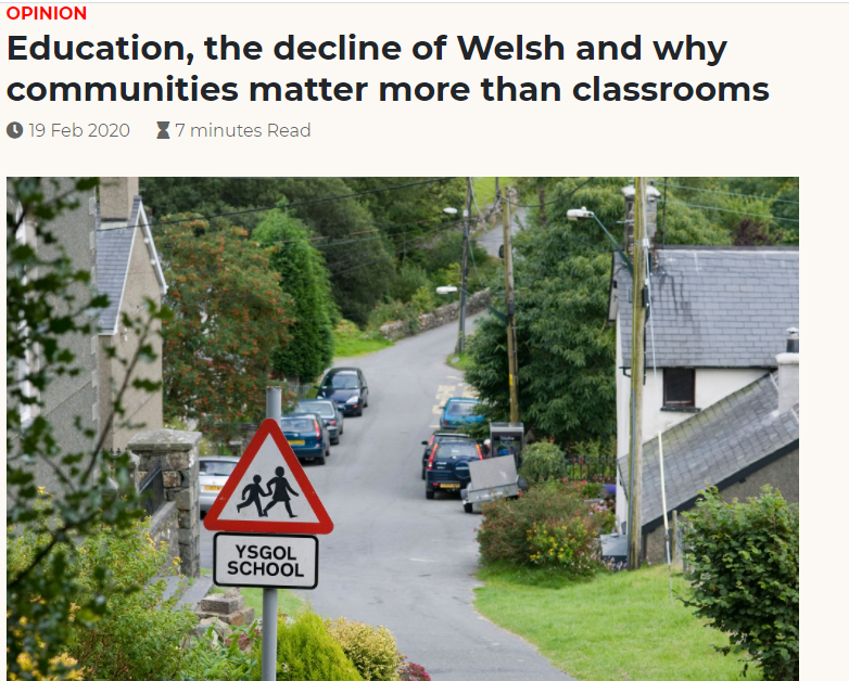
I have really struggled to choose something to 'protest' about since I have many things that I feel strongly about. After a lot of thought I was between exploring the idea of Woke culture and the 'decline' of the Welsh language in certain areas of Wales.
The whole idea of Woke culture really gets on my tits. It seems that more and more people are becoming increasingly sensitive to harmless things in today's society. I understand that some things are triggers for some when they aren't for others, however I think that this idea of not being able to speak freely about your beliefs/opinions for fear of the woke cult hounding you with abuse because your opinions are different to theirs, its utterly ridiculous!! I feel as if shielding yourself or simply hiding away from the things that make you uncomfortable or things that you disagree with is so unhealthy and I think all around makes you ignorant of the issues that arise in today's society. Through exposing ourselves to other's/different opinions, we educate ourselves in order to form informed and rational opinions on issues etc. I think that it makes you an overall well rounded person. It's OK to disagree with others and have different opinions! However... In the end I decided to go with the Welsh language option since I thought that'd be something less 'risky' and also something that's different since I am a Welsh speaker in an English University and perhaps many of my peers will not have been 'exposed' to these issues. (HOWEVER for your viewing pleasure*, I find these videos very good when it comes to explaining the problems with woke culture that is prevalent in today's society.) Jonathan Pie is great and is spot on with most things, he says things that most are scared to say for fear of being labeled something they aren't. *VERY STRONG LANGUAGE!
|
|
|
Brittonic languages -Wikipedia article
Welsh language data from the Annual Population Survey: July 2019 to June 2020
Welsh language- fast facts
Welsh language data from the Annual Population Survey: July 2019 to June 2020
Welsh language- fast facts
VIDEOS
|
|
|
PINTEREST (duh)
As always I find that Pinterest is a great source of inspiration. I've made a board in which I have inspiration for badges, posters and stickers. They don't all necessarily fit my chosen topic, they do however have an aesthetic I would like to take inspiration from.
As always I find that Pinterest is a great source of inspiration. I've made a board in which I have inspiration for badges, posters and stickers. They don't all necessarily fit my chosen topic, they do however have an aesthetic I would like to take inspiration from.
@mythsntits -Instagram
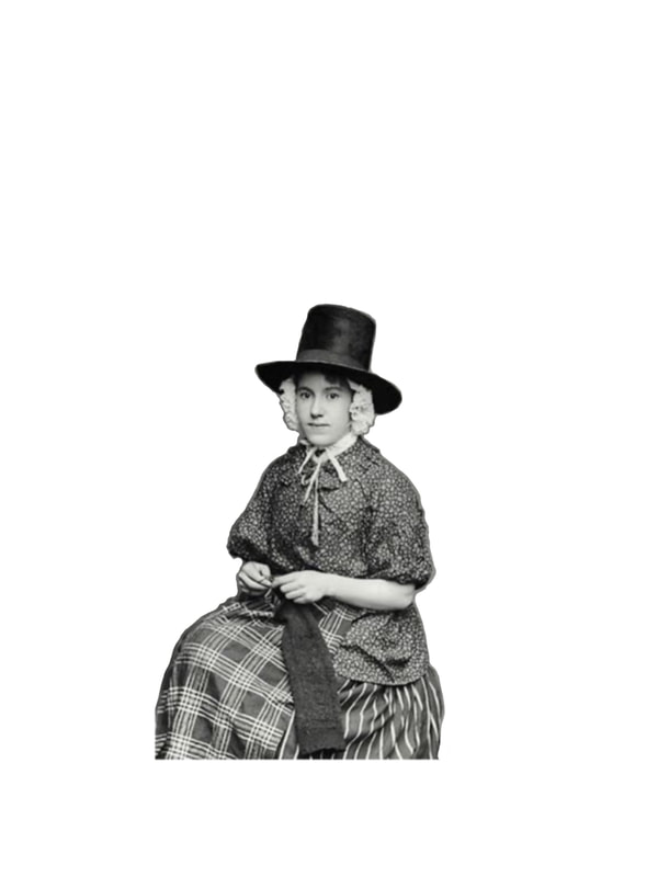
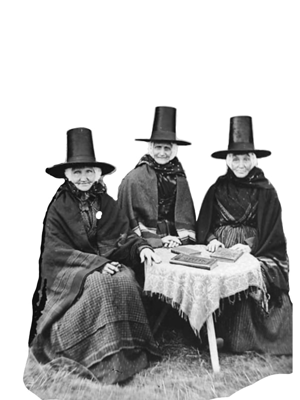
I really like this artists work. I find her work very eye-catching and aesthetically pleasing. She is an artist who is seemingly inspired by her Welsh and Queer identity. I particularly like her welsh ladies deigns as they stand out from a lot of the other stuff that's out there when it comes to Welsh artists.
Brainstorming
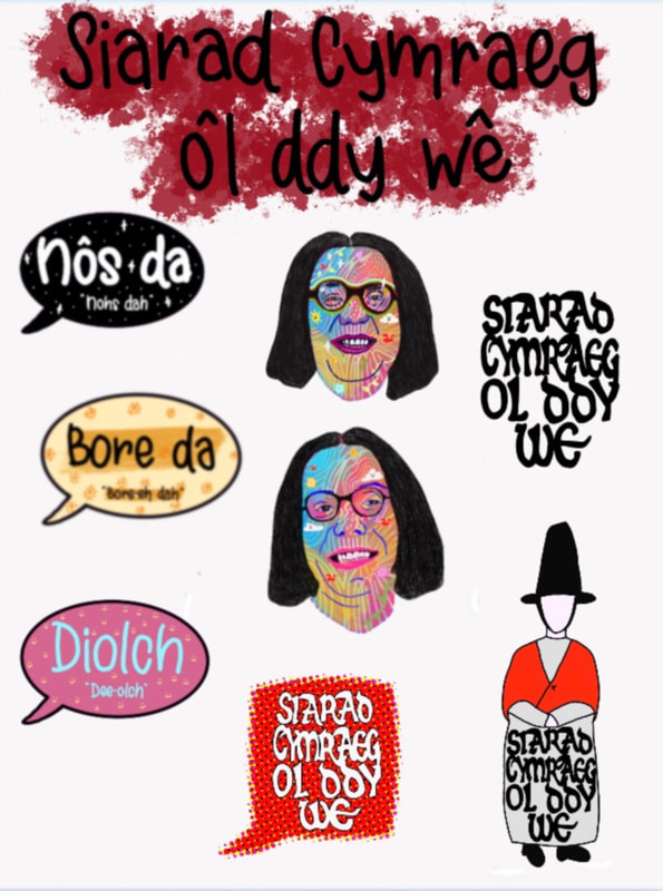
When thinking of a protest pack, I think that having things like badges, stickers, bookmarks, pamphlets and posters are a very fun and informative way to get points across. I also think that I would like to have all the physical contents of my protest pack presented in a tote bag.
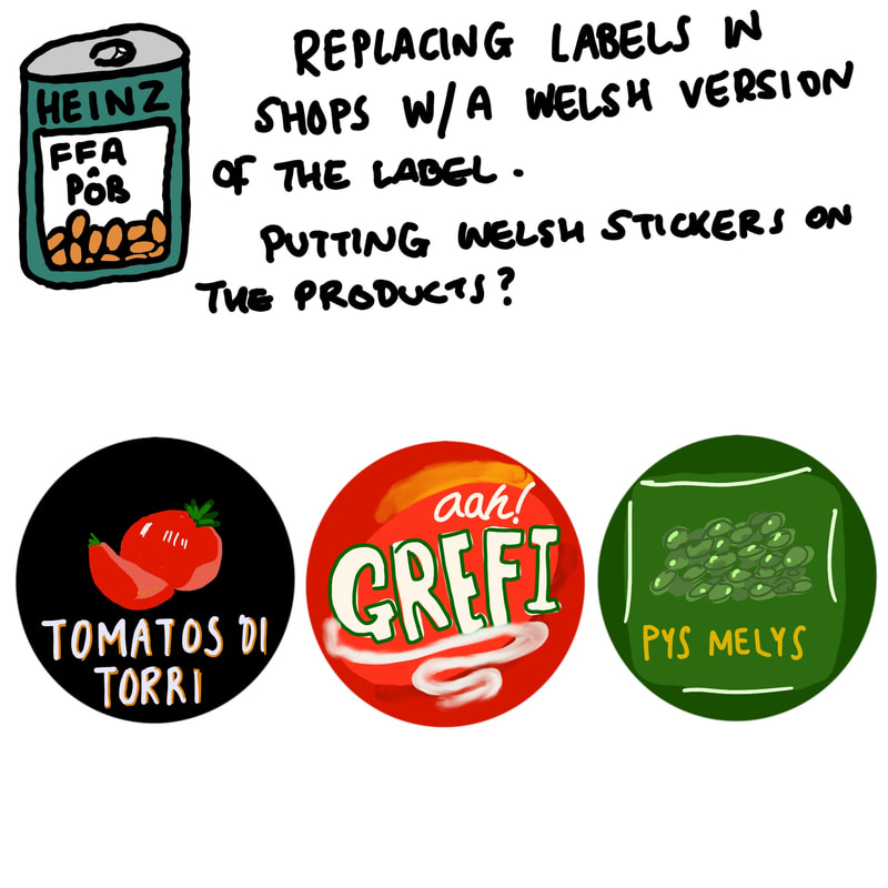
Another idea was to replace English food labels with Welsh ones. So essentially designing the labels exactly the same apart from the language that's on them.
Another idea was to replace English food labels with Welsh ones. So essentially designing the labels exactly the same apart from the language that's on them.

|
|

|

|
Celtic font. I can use this in some of my designs perhaps?
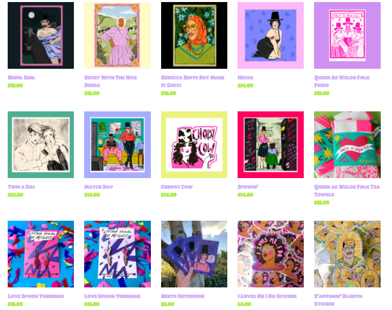
Badges & Stickers
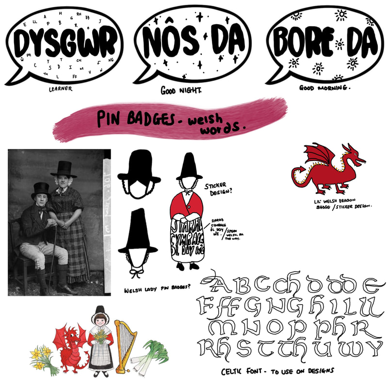
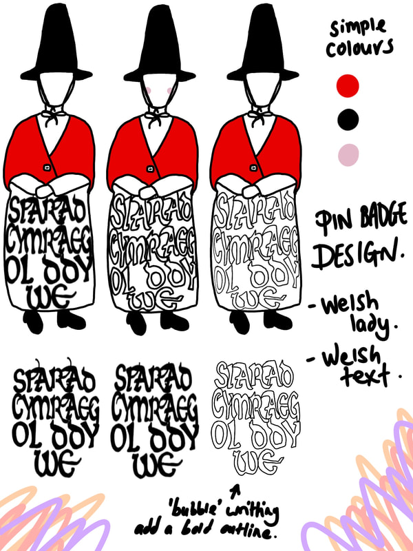
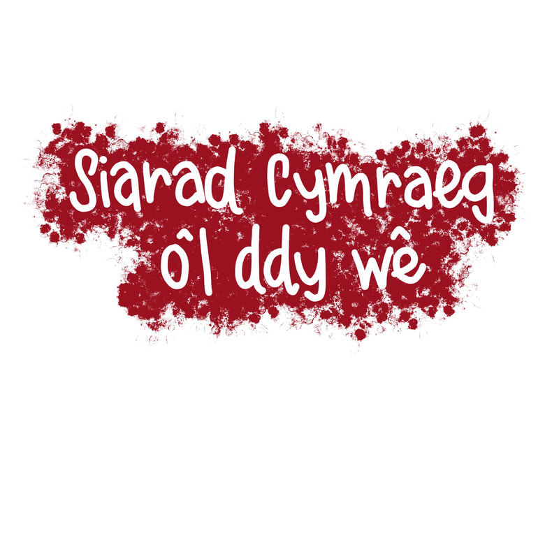
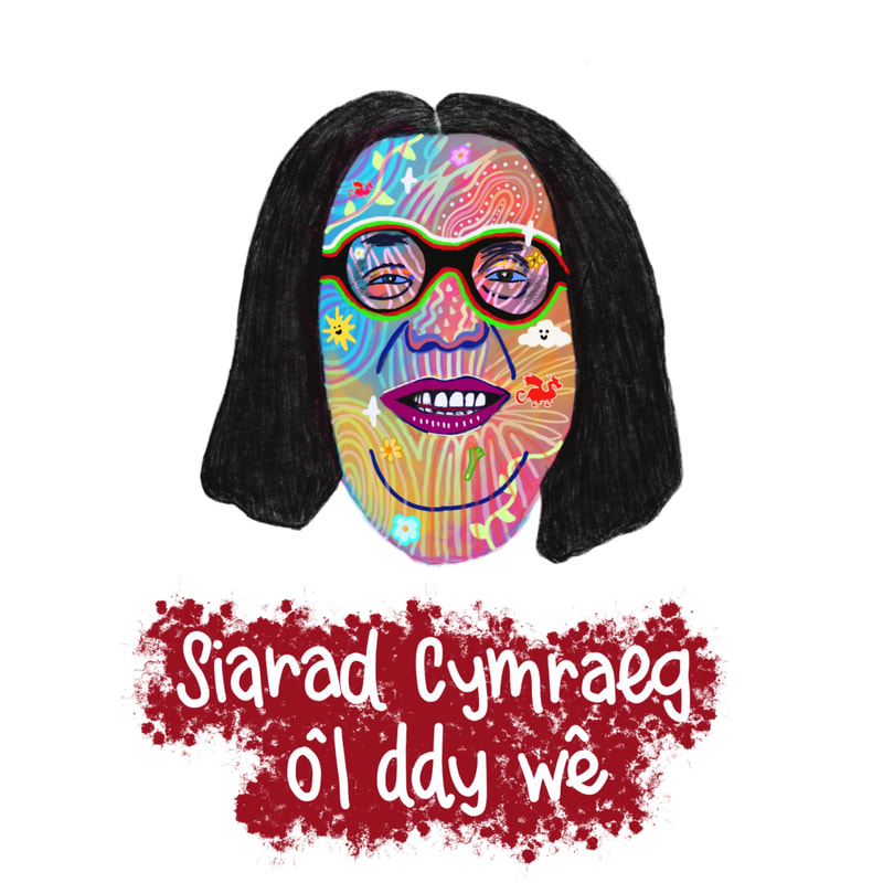
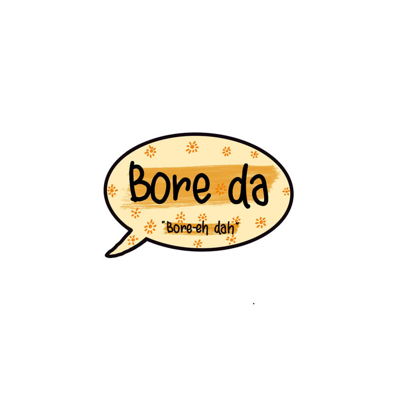
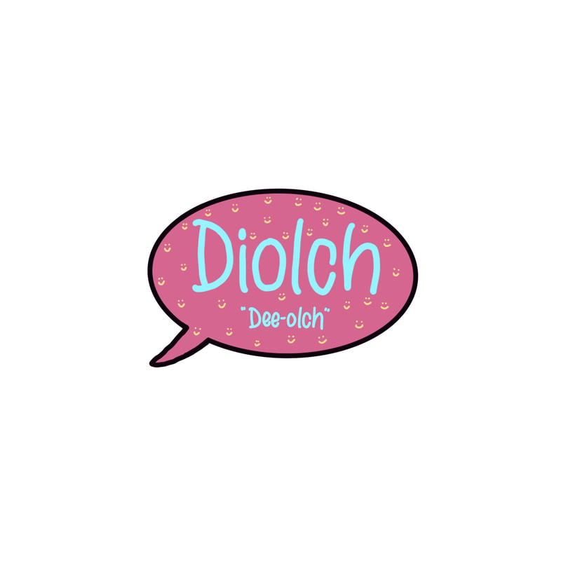
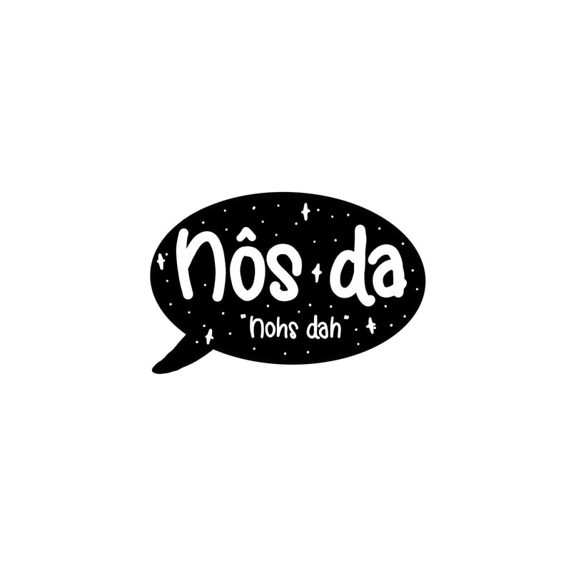
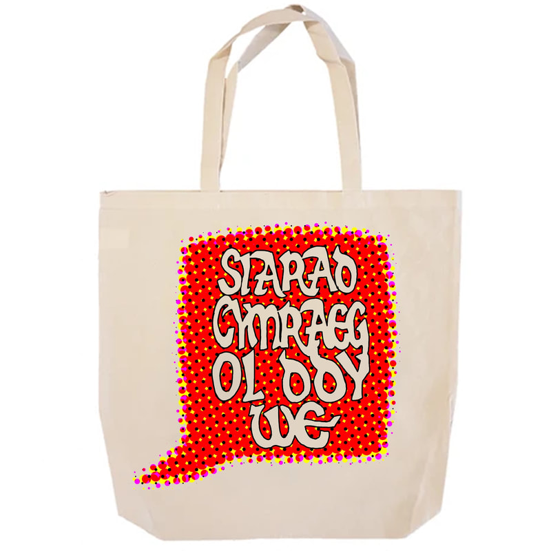
My first badge design idea was to make a Welsh lady, as I feel that a lot of people are aware of and can identify the traditional Welsh dress. I also want to incorporate Welsh text into the bade, I find that putting it on the front of the dress works well. I have used the words, "Siarad Cymraeg? Ol ddy we" (speak Welsh? All the way) which is the 'slogan' if you will for my protest pack.

|

|
I want to keep the colour pallete for my badges simple. I also think that when it comes to producing pins you can only have a specific amount of colours, and I think that too many colours looks bad.

|

I quite like the pattern on the back-card.
|
STICKER IDEAS

|
|


I made sticker mockups on Stickerapp.co.uk , you can print stickers in bulk here and they also offer a range of different materials and sizes for your custom stickers.
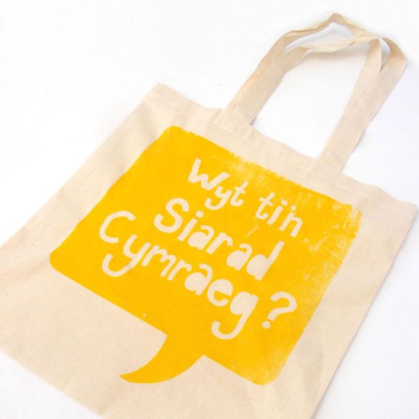
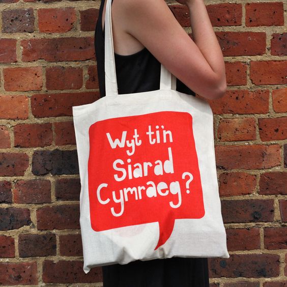
Tote Bag
An image I found on Pinterest made me think that making a tote bag would be a fun idea. This bag translates to, "Do you speak Welsh?"
|
|
Posters

0 Comments
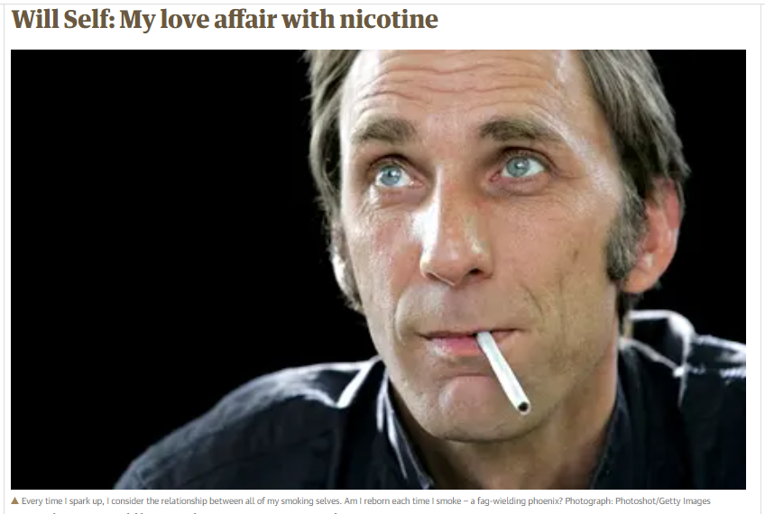
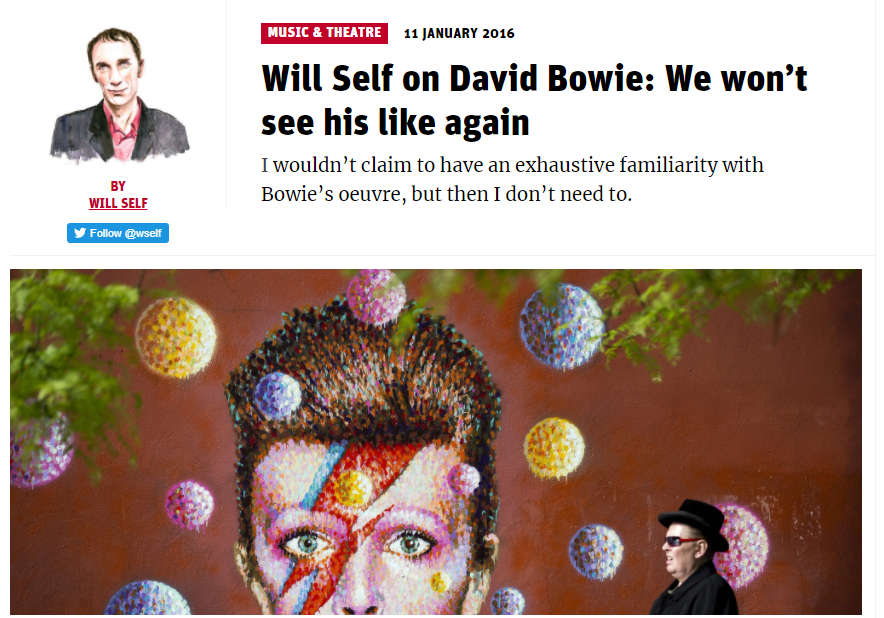
This week we were given 4 possible projects to choose from. I chose option number 1- Editorial Illustration as that appealed to me the most. From the possible list of writers to choose from, I chose Will Self. I am familiar with his work, and am familiar with him from the program, "Shooting Stars" he kinda intimidated me but I kinda had a short-lived weird crush on him... my taste in men is immaculate (sometimes) . He also has his birthday the same day as me!
BRIEF:
"You are asked to produce a series of 3 editorial submissions, one for each week of this project's timetable allocation."
"You are asked to produce a series of 3 editorial submissions, one for each week of this project's timetable allocation."
Looking at Examples:
I found some examples of editorial illustration on Google images.


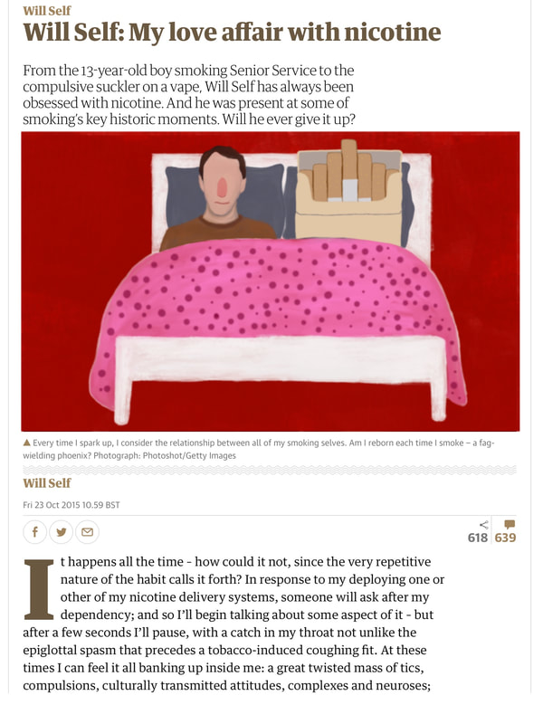
ARTICLE: FIRST WEEK
Like with all my projects, I like to create a Pinterest board with images relating to the brief. I find that it helps me with inspiration and therefore helps me generate ideas. Here's what I've been looking at:
Thumbnails:
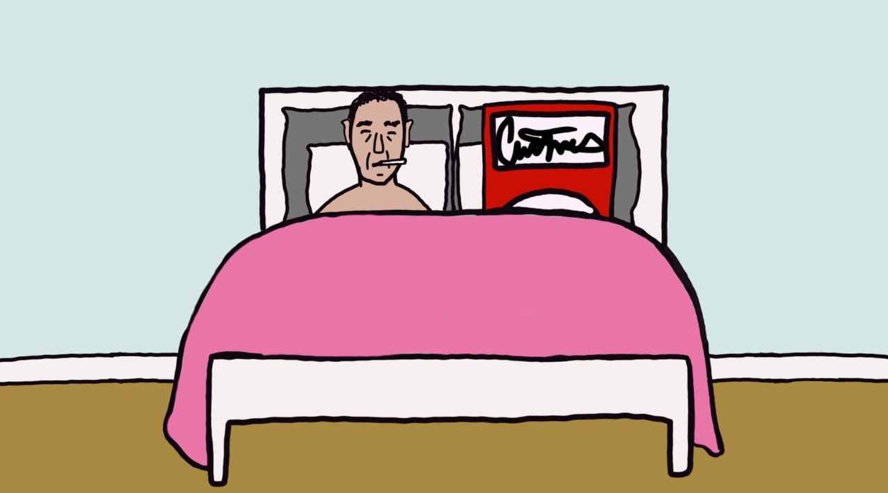
After reading the article, I had a few ideas come to me. Since the article is about the writer himself I decided to include him in the image.
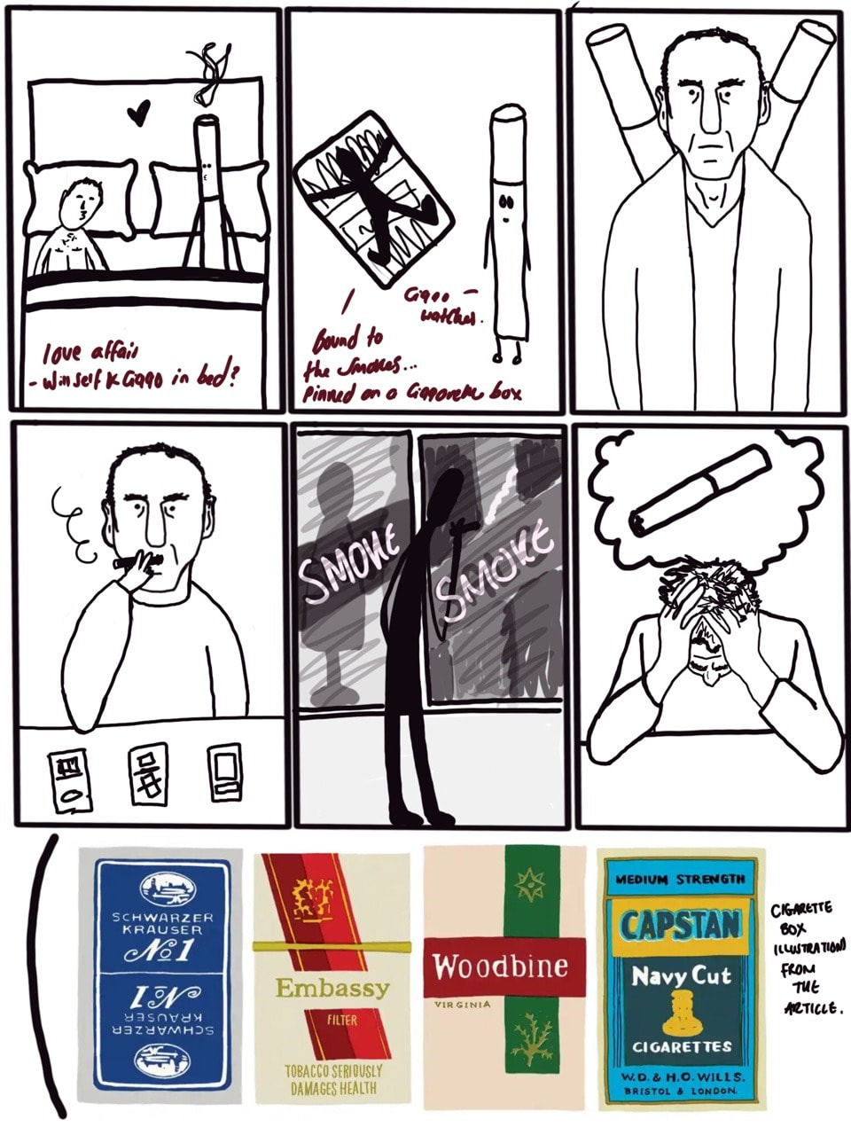
I quite liked the idea of having Will Self in bed with a cigarette, I thought it'd make for quite a humorous piece. I explored the idea of having a box of cigarettes in the bed instead of a singular cigarette. I also liked the idea of having a repetitive pattern of cigarettes in the background.
Developing ideas further:
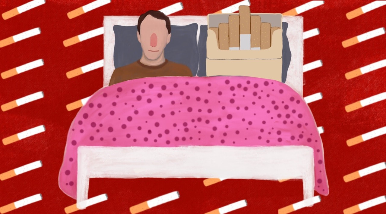
I decided to get rid of the extra things in the image as I thought it was beginning to get a little too busy and wasn't what I was aiming for in this piece.
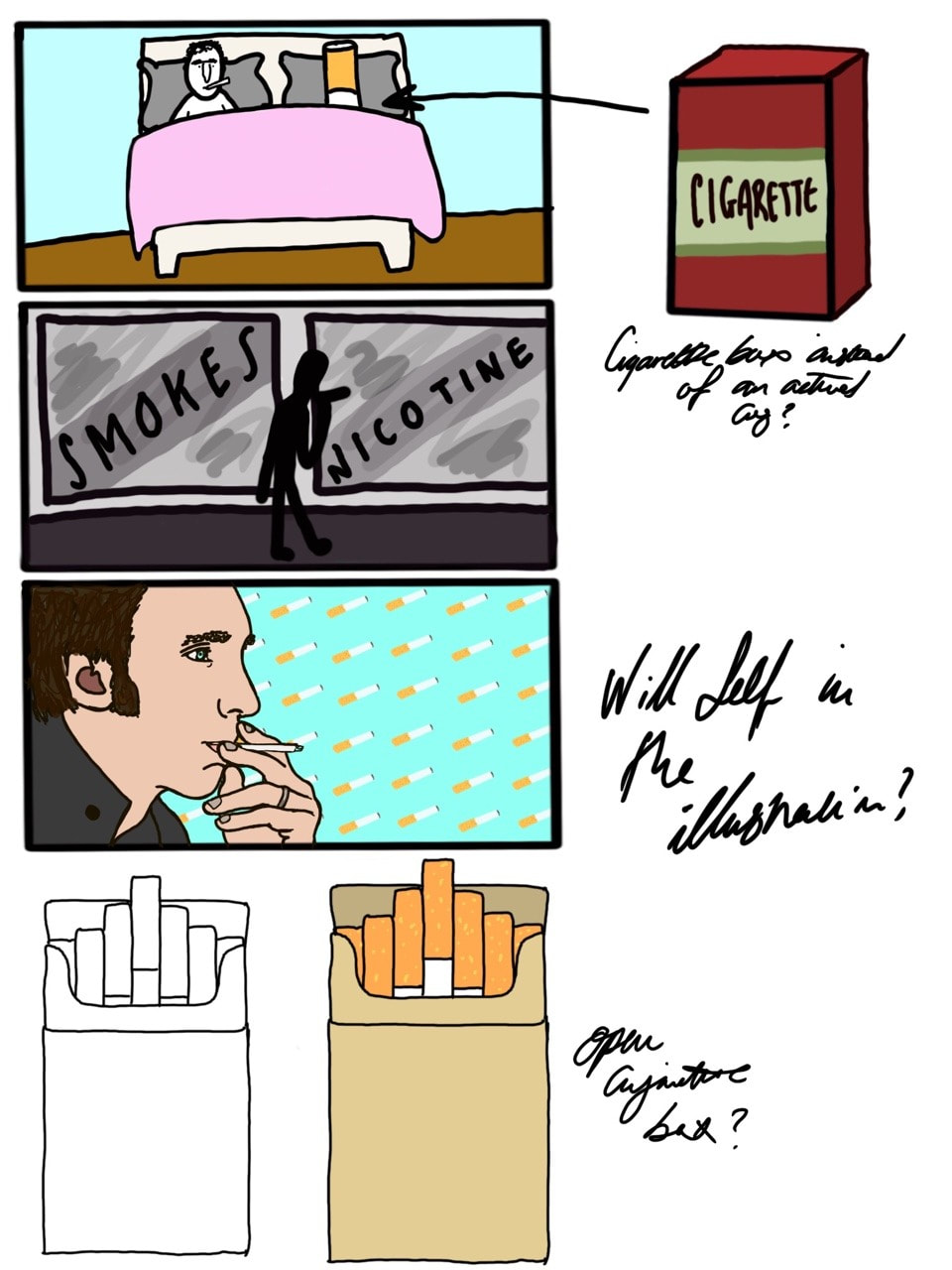
After some feedback, I decided to draw an open cigarette box in order to make it clear as to what it is; without it being open, it could be anything so I need to make the content more recognisable and easy to understand.
After some feedback, I decided to draw an open cigarette box in order to make it clear as to what it is; without it being open, it could be anything so I need to make the content more recognisable and easy to understand.
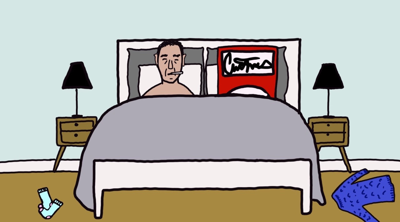
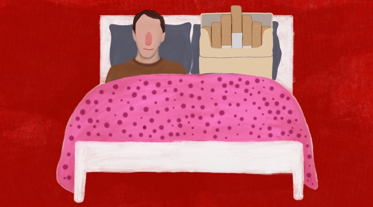
Final Idea:
For the final idea I decided to go as minimal as possible, so I got rid of the background drawing and opted for a solid color background instead. I'm not sure whether I need the cigarettes in the background or not, but I think both options work?
ARTICLE: SECOND WEEK
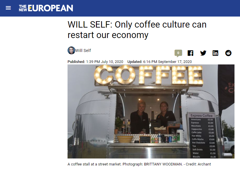
Here I read through the article and highlighted some 'key' bits that I could explore further for creating images.
|
|
|
Thumbnails & Quick Ideas:
I made another Pinterest board with 'coffee' related pictures/drawings etc. for inspiration.
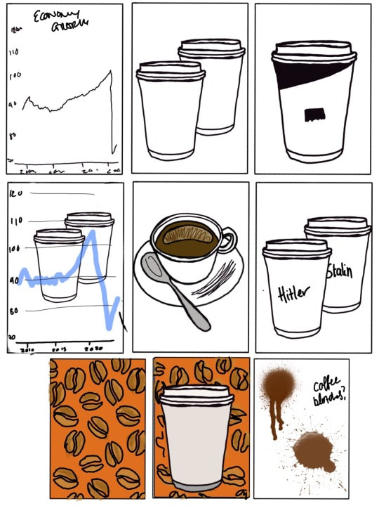
I liked the graph idea for my final piece, so I decided to explore different ways I could incorporate the graph into my work. In addition to this, the coffee beans in the background was something I thought worked well, so I'd like to incorporate that into the final piece as well.
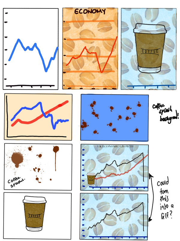
Development
I created two different backgrounds, one for the coffee graph and one for the Coronavirus graph. The idea is to show the economy declining and then increasing once coffee is introduced.


I thought that adding coffee splashes onto the first image would be a good way to incorporate the second image.
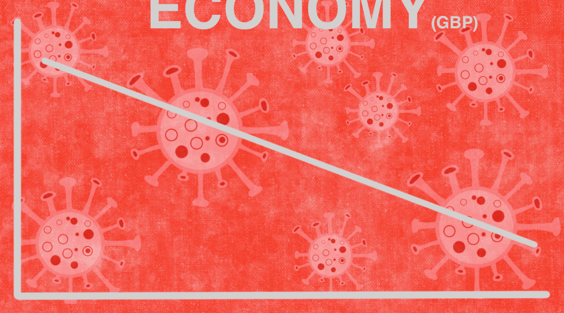
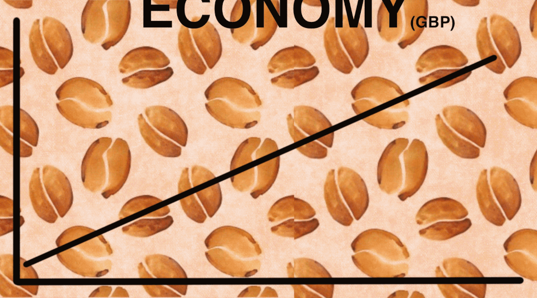
FINAL GIF Version
The idea with this was to have the two gifs blend into one another in order to create one gif. The frame rate is a little off, so it needs a little tweaking.
Changing my piece.
After some feedback with Tony, we decided that the final piece wasn’t really suitable. So I’ve decided to rethink the design. The first design I focused too much in using symbols to represent things instead of thinking of what image I could use to represent the article.
New Idea
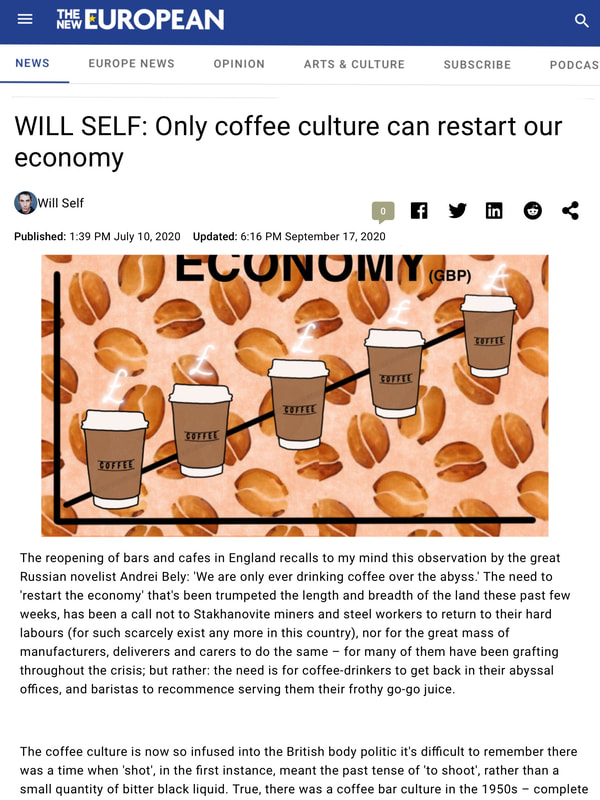
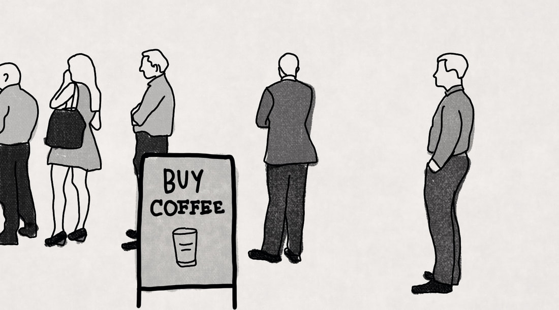
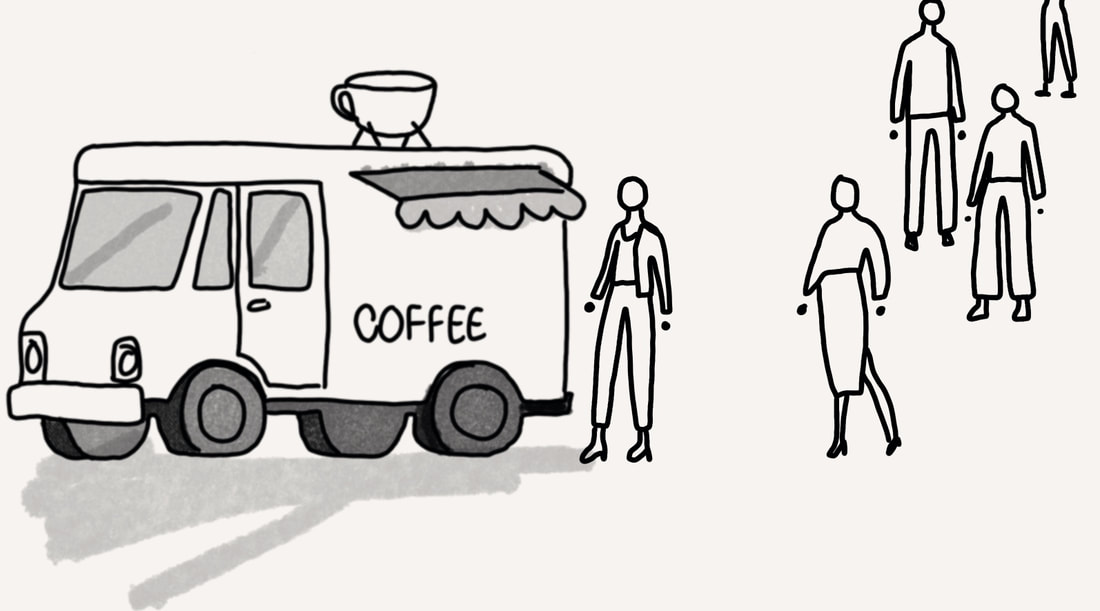
One of my ideas was to go with a queue of people waiting to buy coffee. The queue of people was something Tony mentioned I could try out for this article.

ARTICLE: THIRD WEEK
RESEARCH
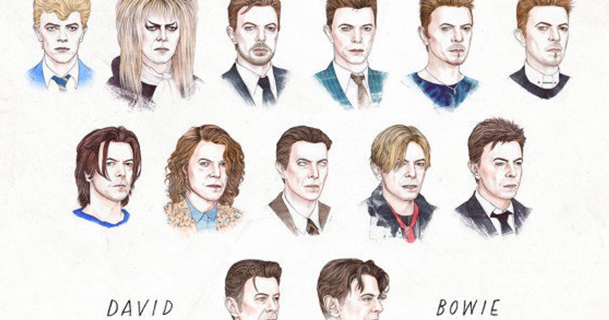
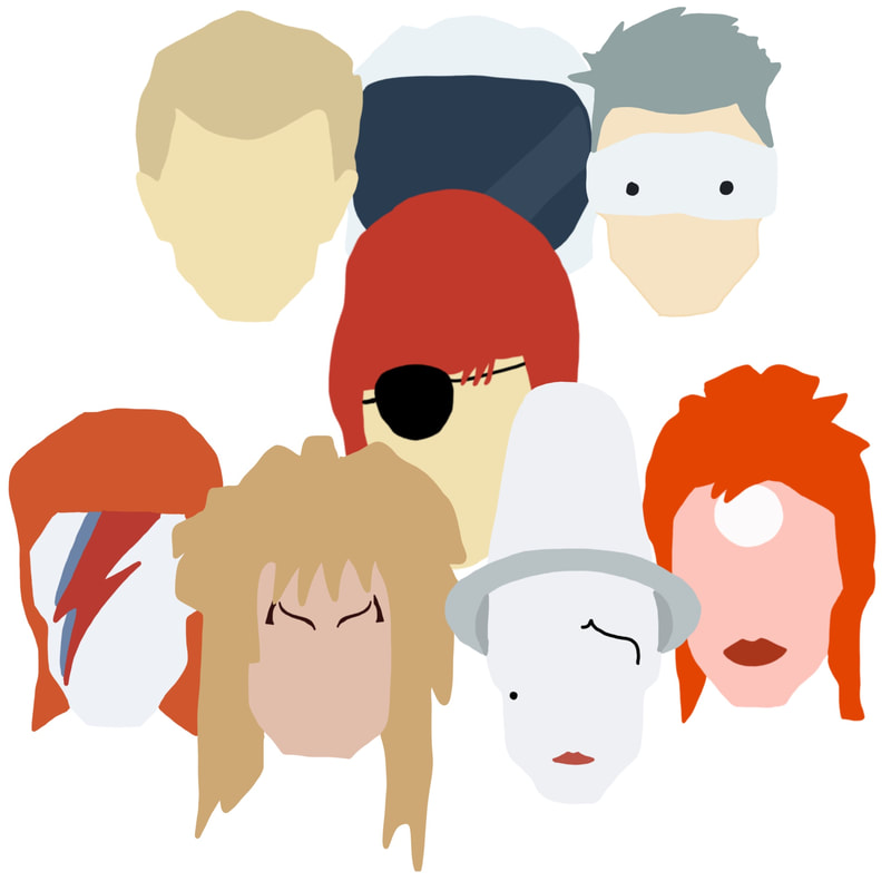
My initial idea when I first read this article was to include multiple drawings of Bowie in his different eras. The picture below is a good example of this. Somehow I want the faces to merge into different ones, perhaps I could explore this option as a GIF?

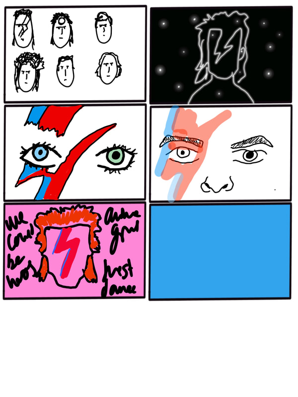
Thumbnails
Development
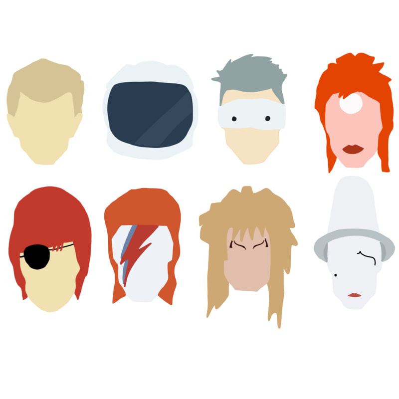
I thought I'd create vector like images of Bowie in his different eras... Space Oddity, Ziggy Stardust etc to show the vast personalities and individuality of Bowie which is mentioned within the article.
Final Idea

Brief
One illustration is a full-page, full bleed image which should be presented as follows: CMYK - image size 160mm wide X 226mm high at a resolution of 300 dpi. Note: this dimension includes a 3mm bleed around all four sides.
The second image is a black and white chapter heading that is aligned to the body of the justified text. As such it must occupy an area of 105mm wide X 50mm high. Note: there is no requirement that it has to have a crisp, rectangular edge so you may treat it as a vignette.The final artwork should be presented as a 300 dpi, grayscale image.
The second image is a black and white chapter heading that is aligned to the body of the justified text. As such it must occupy an area of 105mm wide X 50mm high. Note: there is no requirement that it has to have a crisp, rectangular edge so you may treat it as a vignette.The final artwork should be presented as a 300 dpi, grayscale image.
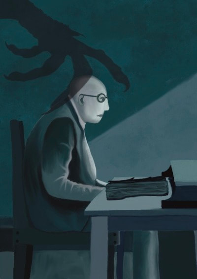
My Story- Canon Alberic's Scrap-book (M R JAMES)
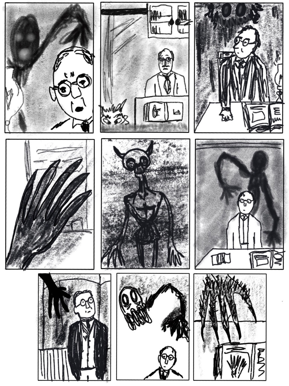
This for me was a key scene and one that contained the most imagery for me to work with. I thought that the idea of this demon's hand reaching over Dennistoun's head would make an interesting piece.
Looking at some inspiration:
Thumbnails
Stock photos are hilarious. I looked at a few of a man sitting in a chair as I wanted to draw the main character sat by his desk. I work much better using reference images as opposed to working purely from memory. I flipped the image in Procreate as I found that facing to the right worked better.

I started off with quick thumbnails. Again, I found that the demon reaching over Dennistoun's head really stood out for me, so I tried different compositions, where I focused mainly on the demon and the main character. I also looked into perhaps drawing the cathedral...but I preferred the other option as it made for a more dynamic piece.
|
|
I must admit I struggled with the vignettes, I found it difficult to think of what I could draw that'd fit the story appropriately. Here are some quick initial ideas below:

Developing the pieces further
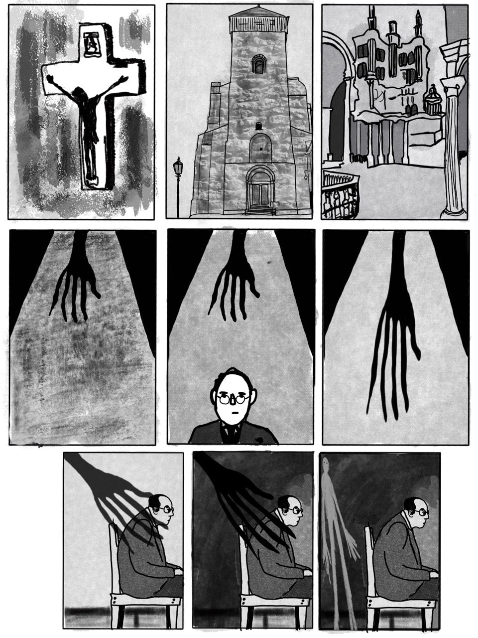
I wanted a dark colour palette in order to create an atmospheric piece. I took inspiration from pieces I saw on Pinterest during my research that also used this type of colour palette. I think the colours help with making it a bit more spooky. I found the process of using procreate enjoyable . Here are some developed pieces that I thought would work well.

After some feedback with Tony, I decided to re-look at the composition of the piece. I liked the idea of haveing Dennistoun. sat by his desk and the demon's hand but I found that the above did not capture the scene appropriately, therefore below I thumbnailed some quick alternative compositions, adding in a desk and a book in order to fit the piece better.

Furthermore, with the vignettes, we discussed that drawing the cathedral in which the story begins in would be an appropriate fit for the piece as it kind of sets the whole story. below are quick thumbnails I produced.

Final Large Illustration
Final Vignette


Week 1- Illustration in Response to the Written Word
The first brief we've been given is to create an editorial illustration based on an article we've been given. Here is the article I chose at random:
And here's what I have to produce:
1 × illustration
135 × 75mm
CMYK
&
1 × spot illustration
45 × 65mm
B&W
1 × illustration
135 × 75mm
CMYK
&
1 × spot illustration
45 × 65mm
B&W
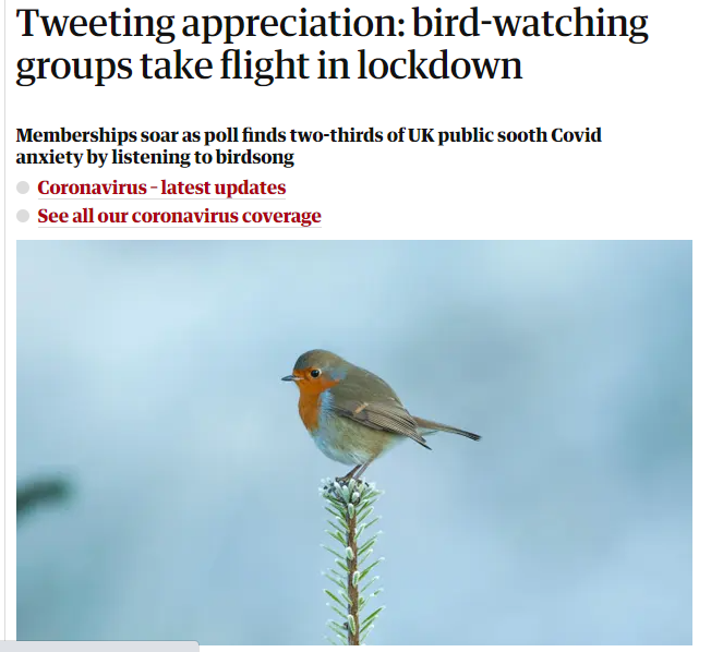
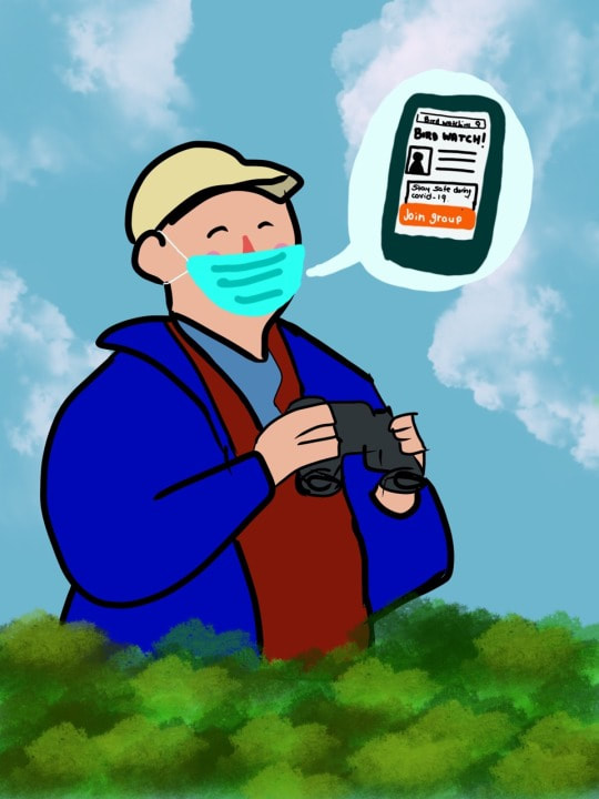
In brief, the article writes about how Bird Watching has become increasingly popular during the lockdown period and that bird watching groups have seen their memberships rise due to this. Many are using bird watching and listening to bird song in order to help cope with their anxiety during the pandemic.
Overall, the article is uplifting and lighthearted. I need this to reflect in my illustrations.
Overall, the article is uplifting and lighthearted. I need this to reflect in my illustrations.
Brainstorming:

I have also recently invested in Procreate for the iPad. I'm really impressed with the app and plan on using it a lot more. Please excuse the bad drawings, my pencil hasn't arrived yet so I've done these with my finger which is very difficult! However for quick brainstorming it'll do.

|

|
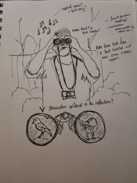
For the main illustration I was thinking of drawing a bird-watcher looking happy and enjoying the tranquility of the outdoors and the birdsong. I'm unsure whether or not to have a piece where the focus is mainly on the bird-watcher (denoting that they are a bird-watcher with the binoculars and other objects perhaps?) or to create a garden based setting with a bird as the main focus. This is something I will have to think about in order to decide which is more suitable for the brief.
Another idea I had was to draw a webpage, or a Facebook page for a bird-watching group and somehow show the member numbers rapidly increasing.
Another idea I had was to draw a webpage, or a Facebook page for a bird-watching group and somehow show the member numbers rapidly increasing.
Looking further into editorial illustration:
Responding to feedback:
I felt that the feedback session we had with Dwayne was very useful. It made me realise that I was going in the wrong direction with my ideas. My ideas are only portraying the idea of bird watching they're not portraying the idea of bird watching during the pandemic, which is what the article is about. So with that in mind, here are some of my new ideas:


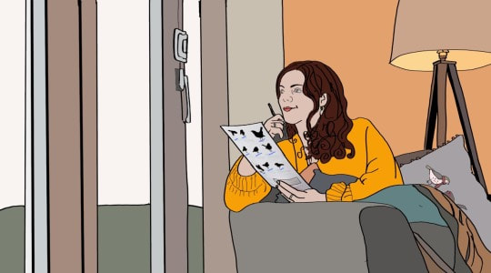
Here I was trying a range of different ideas. I must admit that I am finding it rather difficult to think of things to accurately portray the content of the article. However, I did like the image of the girl sat looking out the window, so I decided to look at this one and develop it further.
Developing Ideas Further.
From the thumbnail sketches, I really liked the idea of the phones and also the person sat looking out the window. I decided to work on these and push them further before deciding on my final piece.
|

|
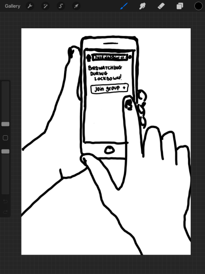
Rough Idea for the spot illustration
|

|
Feedback pt.2
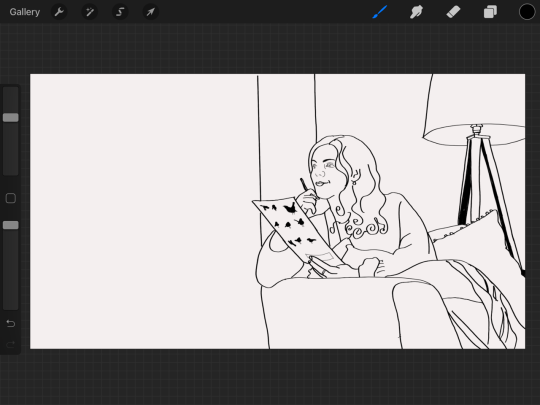
After some very helpful additional feedback with Tony on our Monday session, I looked at my designs again and pushed them even further to fit the article better.
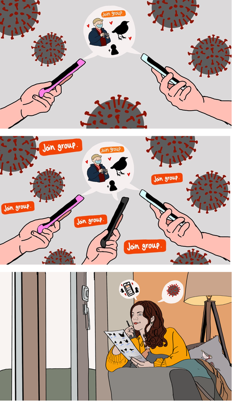
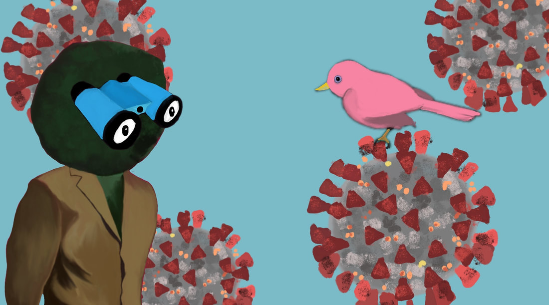
I thought for the person sitting in the window, I could turn their head into a pair of binoculars, the lenses as eyes, looking out the window at the colourful singing birds. The coronavirus is the wallpaper, but the person has their back to it and is instead focusing on the birds, and the phone on the blanket has the bird watching group on it... which I hope relays the contents of the article a lot better. However I do feel as if this could be pushed further again although I'm not 100% sure how.
I thought for the person sitting in the window, I could turn their head into a pair of binoculars, the lenses as eyes, looking out the window at the colourful singing birds. The coronavirus is the wallpaper, but the person has their back to it and is instead focusing on the birds, and the phone on the blanket has the bird watching group on it... which I hope relays the contents of the article a lot better. However I do feel as if this could be pushed further again although I'm not 100% sure how.
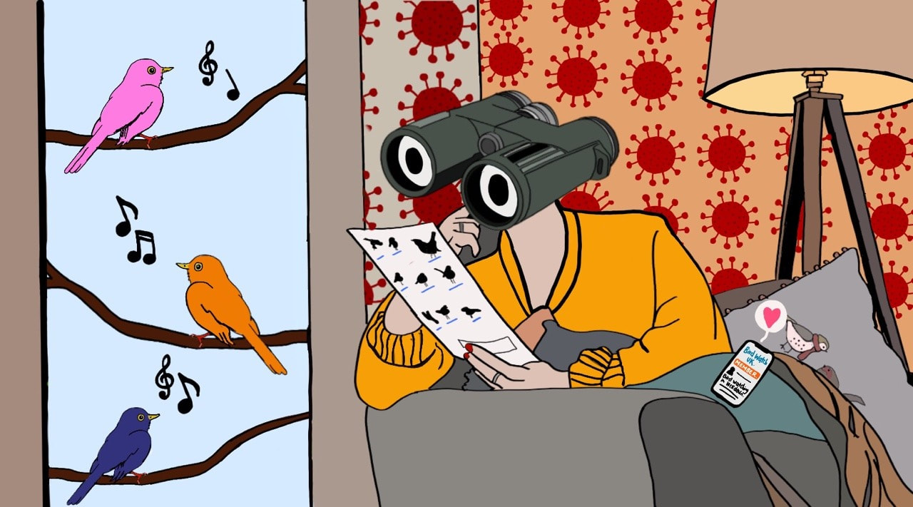
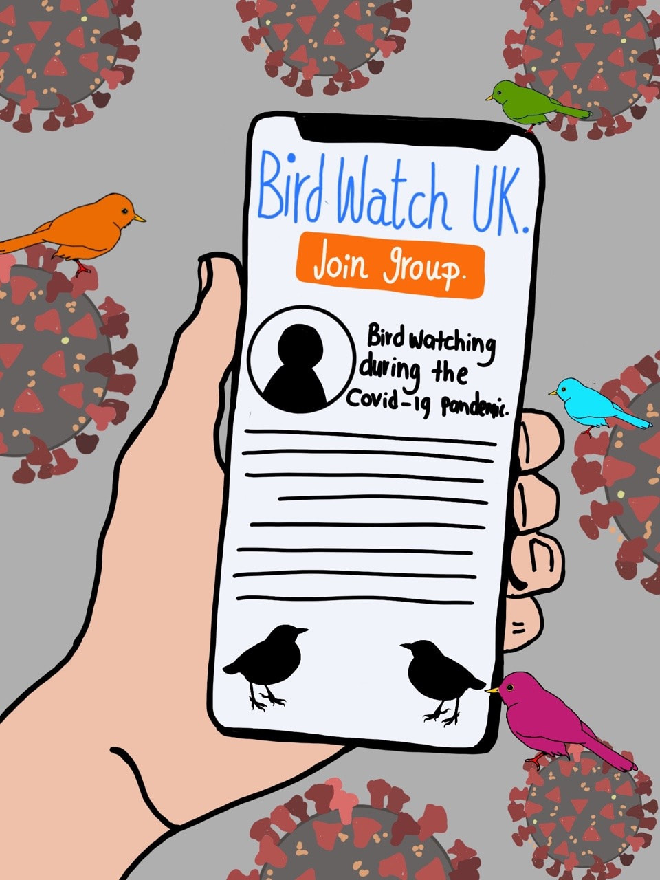
For the spot illustration, I liked the idea of having the phone with a bird watching group page up on it, I think this has clear denotation of the article. I also put little colourful birds on the coronavirus. I must admit when I was making this, I forgot that it was meant to be in black and white, therefore I think I could change the colours in the original piece in order to have a range of different tones which help the piece stand out more in the B&W piece.
|

|
Author
Ffion/ 21/ Welsh/ University of Cumbria.
Archives
April 2021
March 2021
February 2021
 RSS Feed