Researching Enamel Pins.
I've accumulated many badges over the years after visits to HMV and Afflecks in Manchester (if I see a 4 badges for a £1 sign, you've got my money!) I've always loved badges and pins, and I thought I was pretty cool with my The Smiths badges on my pencil case in secondary school. So it'll come as no surprise that I was looking forward to this brief as I've always wanted to design my own pins...However I was not too thrilled at the prospect of using Illustrator properly for the first time.
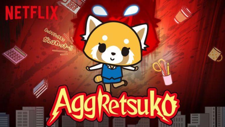
Here's a little board of things I looked at before starting the project: Aggretsuko.
One day I put Aggretsuko on Netfllix as something to have on in the background, a few days later I'd binged the entire 3 seasons of it...so I thought I'd make the cute little characters into enamel badges.
The series follows the life of Retsuko, a 25-year old and single anthropomorphic red panda, working in the accounting department of a Japanese trading firm, trying her best to navigate through the typical problems encountered by young adults in 21st century Japan. Facing constant frustration every day from pushy superiors and co-workers, Retsuko lets out her emotions by going to a karaoke bar every night and singing death metal... relatable stuff let me tell you.
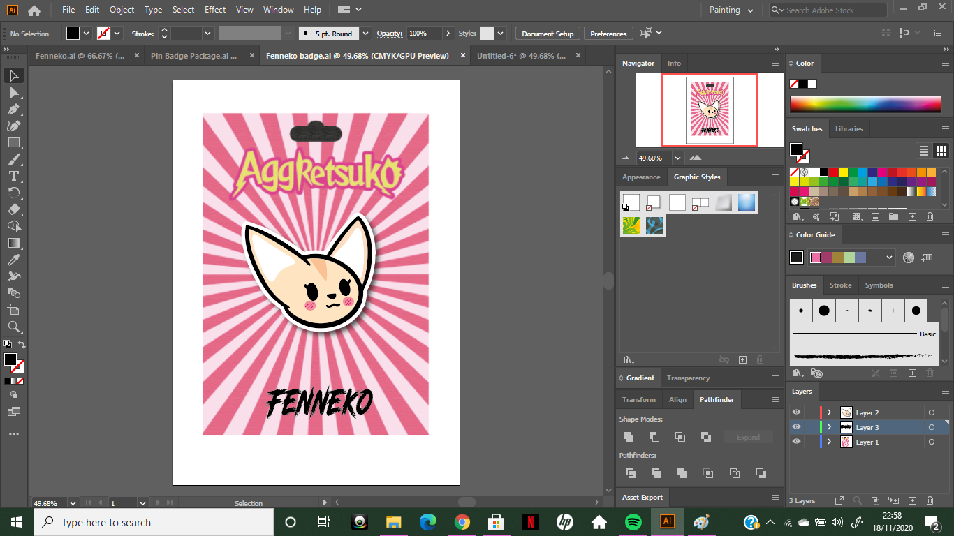
I decided to make, Retsuko, Fenneko and Gori. Designing the badge
I wanted to keep the design fairly simple, as the design of the characters in the show are not overly complicated. I decided to go with making just the heads instead of the whole body as to avoid over complicating things. Getting used to all the different tools was very frustrating!! I found that sometimes something that had worked previously, wouldn't work again or it'd do something different and I'd get close to giving up, but I stuck through and watched plenty of quick and simple tutorials to get me started and the more I played about with everything the easier it got *I use the term easier, lightly*. Below is my first character, Fenneko. This was the easiest out of the three as this was the simplest design to create. I'm happy with how it turned out: 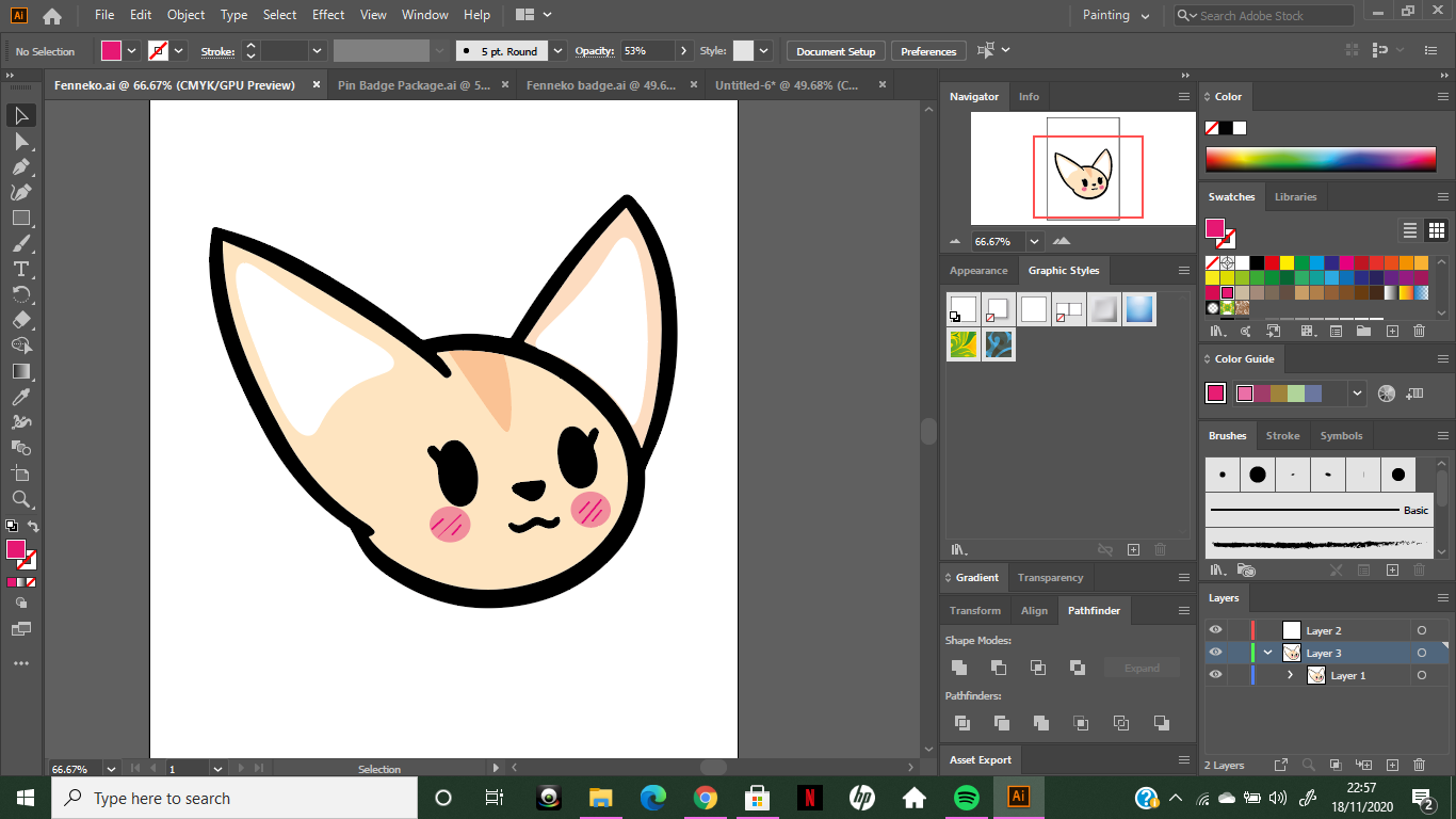
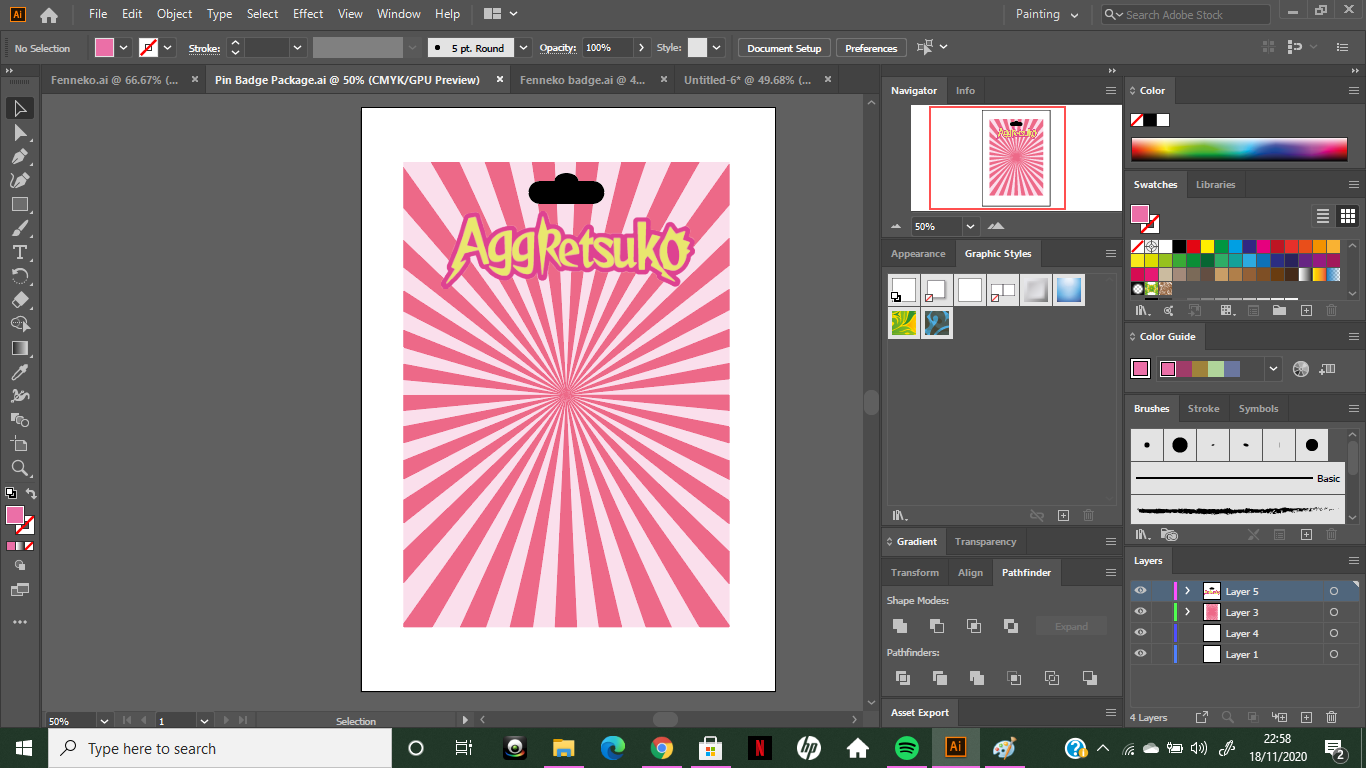
For the packaging (or the backing card) I wanted to have a sunbeam effect... However I had no idea how to do this...but with a super quick Google, I found a super easy tutorial and was able to create my desired effect seen below.
Here's the tutorial for future reference:
After designing the 'card' I copied the enamel badge design and placed it on the card, I added a simple drop shadow and a white border in order to make it seem as if an object had been placed on it. Furthermore, I downloaded a font (Road Rage) similar to the one they use in the show in order to write the character's names.
Here are my three finished badges. Overall I am happy with how they turned out! Using Adobe Illustrator was a big challenge and frustrating at times, but I now feel confident that I could use the program again in order to create more work similar to this.
0 Comments
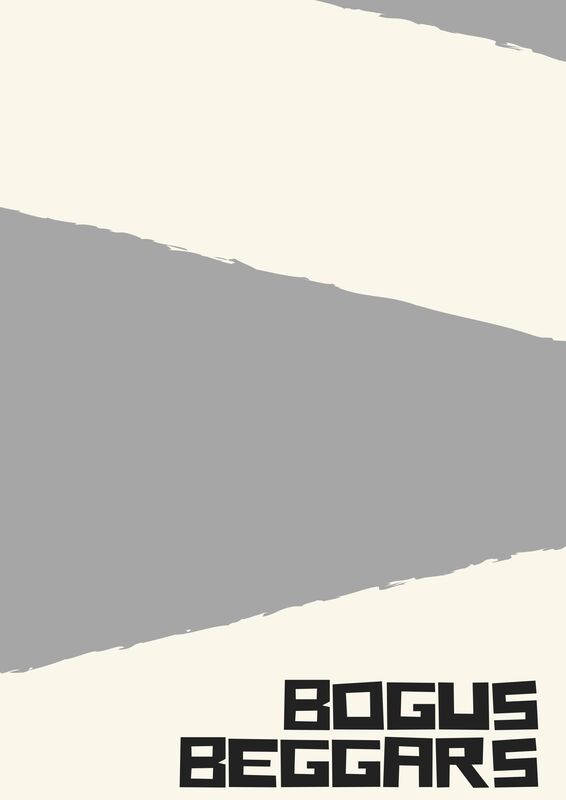
And the name of the band was...Bogus Beggars.
This weeks brief made me very excited. Since I'm very into my music, I was excited to find out that we'd be designing our own gig posters. The band names were given to us by choosing a random number, mine happened to be Bogus Beggars. At first I was unsure whether I liked it or not, but after some thought, plenty of ideas came to me!
As with any task, I went over to Pinterest to look for some inspiration as well as looking at different presentations of posters and techniques used.
I quite like the idea of drawing on top of photographs, or defacing them with splashes of paint or scribbles etc. This is something I plan to look at and consider for my band poster.
I also went through my Spotify playlist, looking at different album covers for any inspiration
With 'Bogus Beggars' I instantly thought of Eton Boys. I felt like members of this band would be from a humble upbringing and would think it was funny to dress up as Eton lads...taking the piss basically. When I hear the word 'bogus' I instantly think of politicians, thus taking my mind to the 'Eton boy' aesthetic.
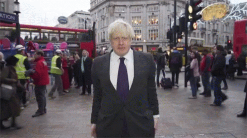
I remembered the photo of David Cameron and Boris Johnson when they were back at Eton, here they are, the absolute lads: 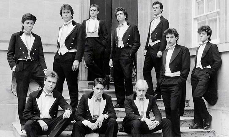
Doesn't that make you feel sick...
As much as I dislike them, I think the poses here are great, it looks as if they're posing for an album cover. So I can definitely imagine the band members of 'Bogus Beggars' parodying this.
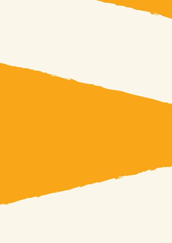
So initially I went with this idea, I liked the yellow, but I changed it to grey because I thought it went better with the image I was using. I wanted the background to look as if it had been ripped, kind of like tearing the mask of deception away and revealing what's underneath.
I struggled with finding a suitable text, but I quite liked this bold text below with an added 'glitch' effect, I think it makes the text look a little more interesting as it jumps out at you more, something you need for a gig poster. 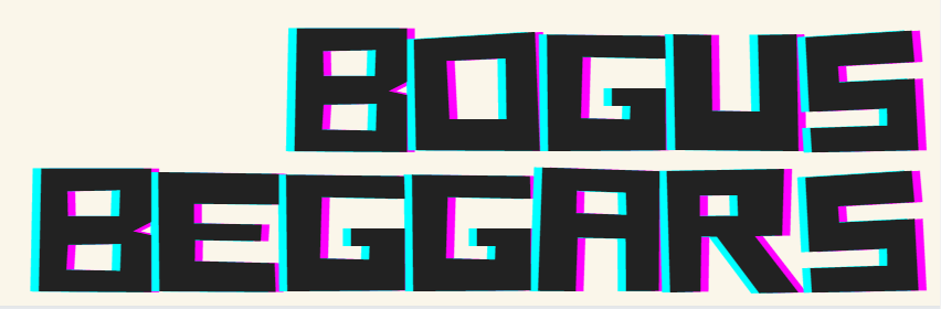
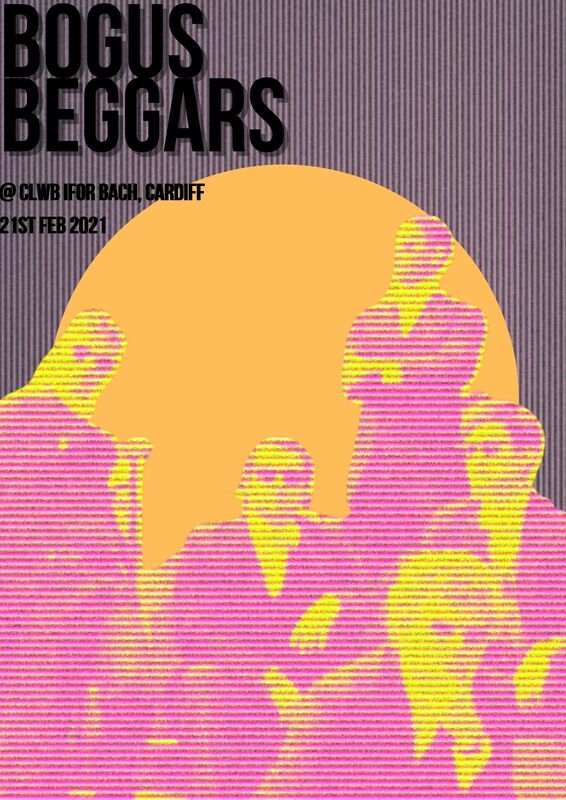
I found a very old image of some Eton lads *rah* , and in making the image background transparent I got this interesting effect. As Bob Ross would say, it was a happy little accident. I was going for a solid black silhouette, but I think this tuned out a lot nicer, and is a lot more interesting to look at as you can still see the details of the image without it being too detailed.
I do quite like this poster, however upon reflection, I do think it might be a bit too simple and I think I could do a lot more than just placing a lightly edited picture onto a simple background. So, with the next design I decided to push myself a little more and begin to do things out of my comfort zone.
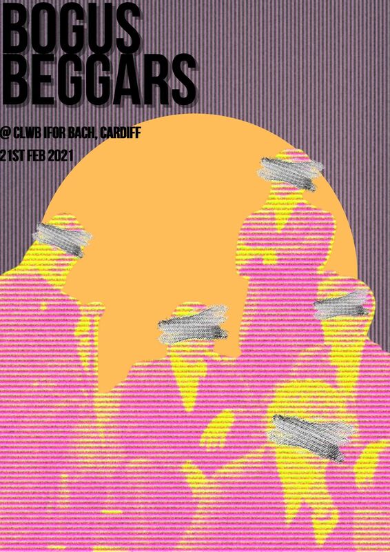
The second poster I did was beginning to shape into something that I don't usually create. I messed around with lots of different textures here, and began to manipulate the background and the image. I added a solid colored shape into the background so that the image didn't get lost in the background. I also decided to add paint strokes over the eyes of the people in the image, taking inspiration from posters I'd seen on Pinterest. I think that this added something more interesting to the poster, however I wasn't entirely happy with this as a finished product so I continued to develop my poster even further.
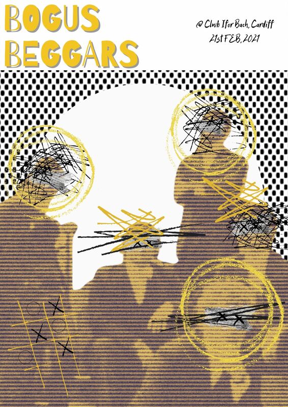
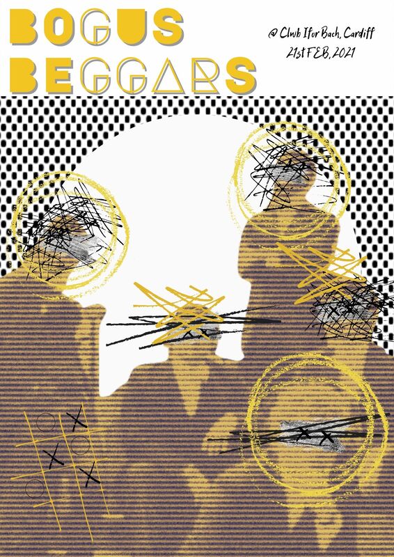
This is where things got really interesting for me. I decided that being too precious over the poster wasn't going to allow me to have an exciting and almost carefree kind of look to it. Pushing the idea of the paint marks further, I decided to add some scribbles and crosses, and I feel as if it has worked well and it suits the image that I have chosen. The only thing that I struggled with was the layout of the text and how I would present it on the poster. I don't think it's terrible, but I also feel that having the text on a plain white background on top, separates the image and the text from each other, as opposed to it reading as one coherent piece. So I feel like, I'm nearly there...but not quite!! Something needs to change, but I'm slightly unsure as to what needs to change.
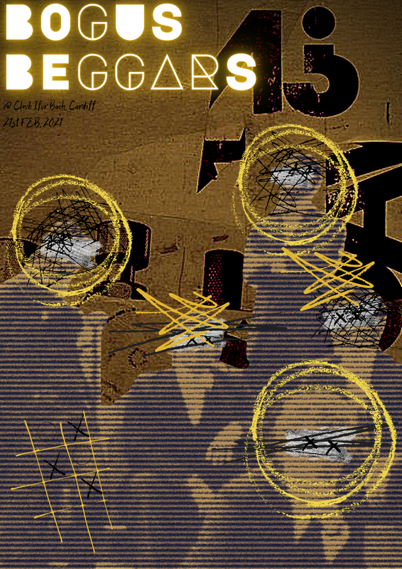
After some serious brainstorming, I decided to scrap the current background and change it to a collage like piece. I feel like this works a lot better with my chosen image and the scribbles and marks I've put on it...I feel as if it fits the aesthetic of the entire poster better. However I feel as if the details of the image and what I've added in get lost in the yellow background. 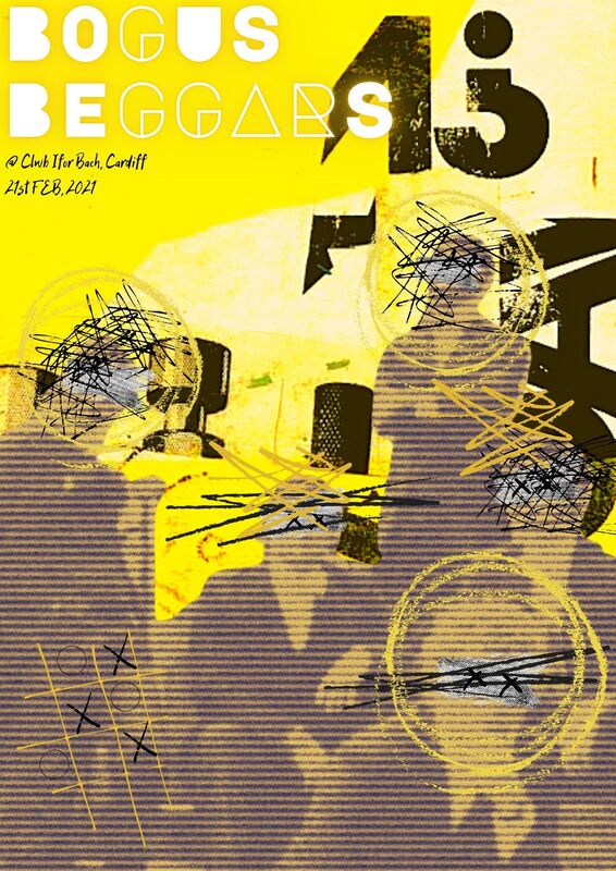
After messing about with the levels I finally found colours that I thought were right for the overall aesthetic that I was trying to achieve for my poster.
|
AuthorFfion/ 21/ Welsh/ University of Cumbria. Archives
December 2020
Categories |


 RSS Feed