Researching Enamel Pins.
I've accumulated many badges over the years after visits to HMV and Afflecks in Manchester (if I see a 4 badges for a £1 sign, you've got my money!) I've always loved badges and pins, and I thought I was pretty cool with my The Smiths badges on my pencil case in secondary school. So it'll come as no surprise that I was looking forward to this brief as I've always wanted to design my own pins...However I was not too thrilled at the prospect of using Illustrator properly for the first time.
Here's a little board of things I looked at before starting the project: Aggretsuko.
One day I put Aggretsuko on Netfllix as something to have on in the background, a few days later I'd binged the entire 3 seasons of it...so I thought I'd make the cute little characters into enamel badges.
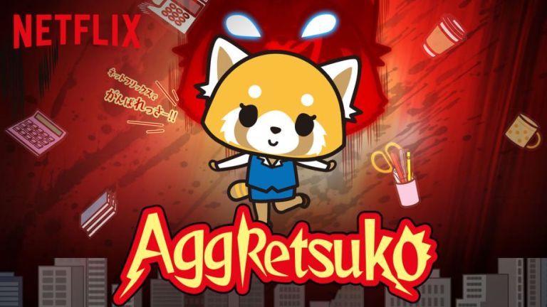
The series follows the life of Retsuko, a 25-year old and single anthropomorphic red panda, working in the accounting department of a Japanese trading firm, trying her best to navigate through the typical problems encountered by young adults in 21st century Japan. Facing constant frustration every day from pushy superiors and co-workers, Retsuko lets out her emotions by going to a karaoke bar every night and singing death metal... relatable stuff let me tell you.
I decided to make, Retsuko, Fenneko and Gori. Designing the badge
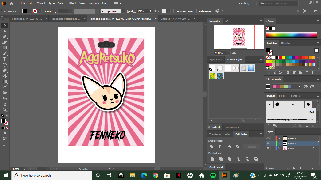
I wanted to keep the design fairly simple, as the design of the characters in the show are not overly complicated. I decided to go with making just the heads instead of the whole body as to avoid over complicating things. Getting used to all the different tools was very frustrating!! I found that sometimes something that had worked previously, wouldn't work again or it'd do something different and I'd get close to giving up, but I stuck through and watched plenty of quick and simple tutorials to get me started and the more I played about with everything the easier it got *I use the term easier, lightly*. Below is my first character, Fenneko. This was the easiest out of the three as this was the simplest design to create. I'm happy with how it turned out: 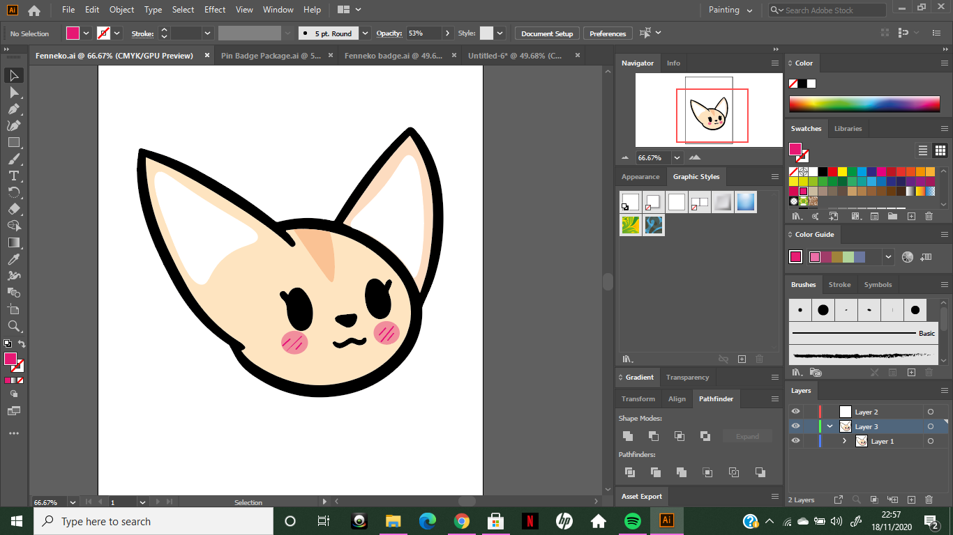
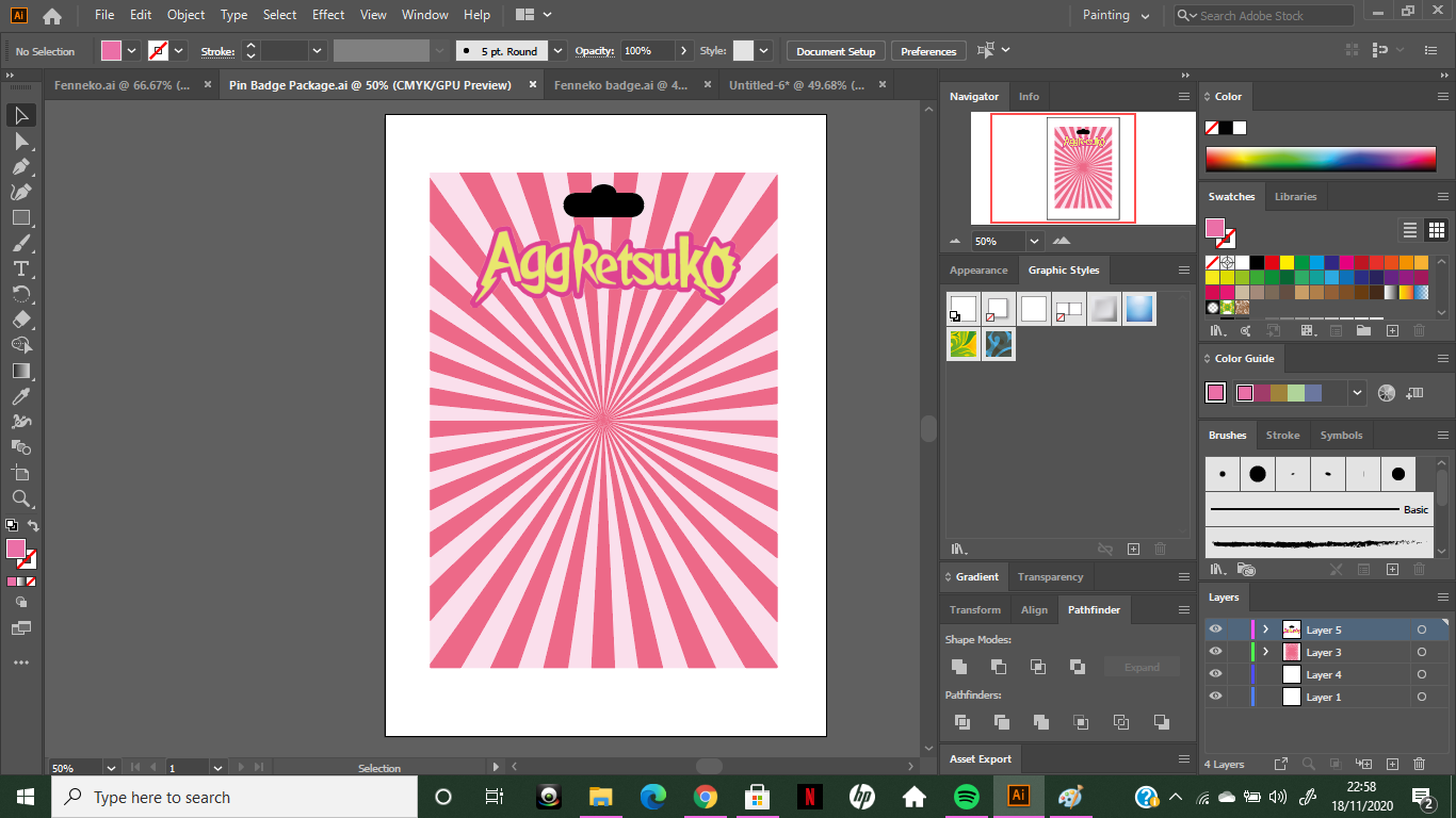
For the packaging (or the backing card) I wanted to have a sunbeam effect... However I had no idea how to do this...but with a super quick Google, I found a super easy tutorial and was able to create my desired effect seen below.
Here's the tutorial for future reference:
After designing the 'card' I copied the enamel badge design and placed it on the card, I added a simple drop shadow and a white border in order to make it seem as if an object had been placed on it. Furthermore, I downloaded a font (Road Rage) similar to the one they use in the show in order to write the character's names.
Here are my three finished badges. Overall I am happy with how they turned out! Using Adobe Illustrator was a big challenge and frustrating at times, but I now feel confident that I could use the program again in order to create more work similar to this.
0 Comments
Leave a Reply. |
AuthorFfion/ 21/ Welsh/ University of Cumbria. Archives
December 2020
Categories |


 RSS Feed